UNLEASHING CREATIVITY: GRAPHIC DESIGN TRENDS FALL 2023 PART 2
 Hey there! Donald Kevin here, thank you for visiting, and welcome to “Unleashing Creativity: Graphic Design Trends Fall 2023 Part 2.” Are you ready to step into the future? Well, buckle up because in this week’s blog post, we are diving deep into the exciting world of graphic design trends for Fall 2023! Last time, we explored the vibrant world of bold colors and geometric shapes in design. But this week, get ready to push the boundaries even further as we unleash our creativity with futuristic and distorted typefaces, embrace the mesmerizing dark mode, delve into the world of ideographic logos, and discover the art of mixing elements in ways you’ve never seen before. Join us on this wild ride as we explore the untamed jungle of design possibilities. Put on your seatbelt and prepare to be amazed!
Distorted And Futuristic Typography In Graphic Design:
As we dive deeper into uncovering the top graphic design trends for Fall 2023, one particular trend that has caught our attention is the use of distorted and futuristic typography. This bold and daring approach to typography not only brings excitement and energy to designs but also pushes the boundaries of creativity.
Typography, often considered an art form in itself, has evolved over the years, constantly embracing new techniques and styles. In Fall 2023, designers are taking typography to a whole new level by distorting letters, warping them, and giving them a futuristic touch. This trend is perfect for those looking to make a statement or capture attention in a visually saturated world.

By manipulating the shapes and forms of letters, designers can create a sense of movement and dynamism in their designs. The distorted typography adds an avant-garde feel, transporting viewers into a futuristic realm. This trend is all about breaking the traditional rules of typography and embracing a more experimental and unconventional approach.
Moreover, the use of distorted typography gives designers the freedom to play with legibility and hierarchy. By intentionally distorting certain parts of the letters while keeping the main structure intact, designers can guide the viewer’s eye and emphasize certain words or phrases. This technique adds an extra layer of depth and complexity to the design, making it more engaging and visually captivating.
Dark Mode in Graphic Design:
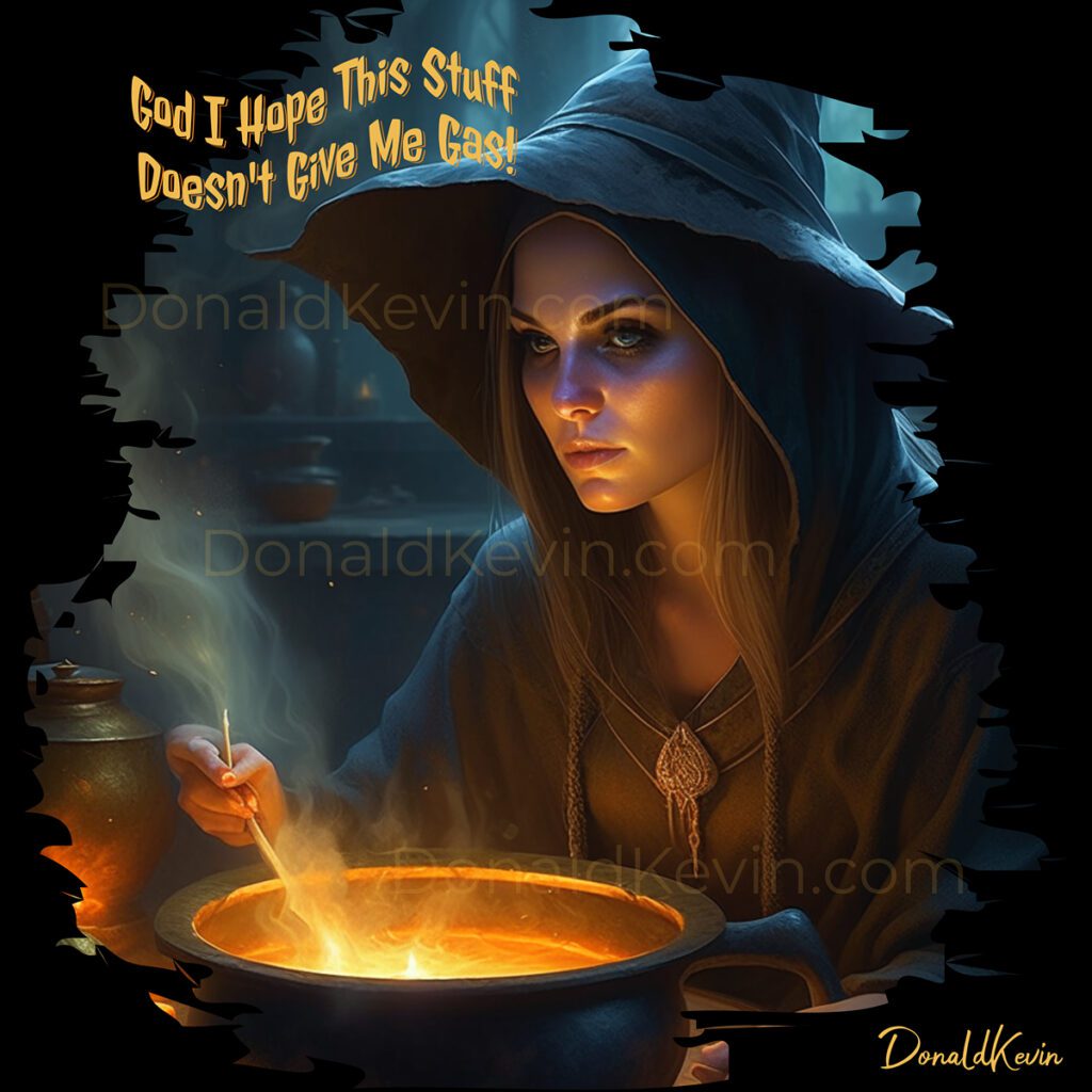
When it comes to dark mode, the possibilities are endless. Designers can explore the depths of their creativity by embracing the mysterious allure of dark backgrounds. This trend allows for a bold and visually striking aesthetic that captivates the audience from the moment they set their eyes on it.
The key to successfully implementing dark mode in graphic design is to strike the perfect balance between light and dark elements. Contrasting vibrant pops of color against the dark backdrop can elevate the overall visual appeal and create a sense of depth. This technique adds an element of surprise and intrigue that keeps the viewers engaged and wanting to explore more.

One of the most exciting aspects of dark mode is its ability to create a dramatic impact. Dark backgrounds provide a perfect canvas for showcasing typography, illustrations, and even animations. By making use of vibrant colors and intricate detailing, designers can make their creations truly come alive and mesmerize the audience. This trend amplifies the impact of any design, allowing for a truly immersive experience that leaves a lasting impression.
Adopting dark mode in graphic design also offers practical benefits. With the increasing popularity of mobile and tablet devices, dark mode optimizes readability and visibility for users. It reduces eye strain and enhances readability, making it an excellent choice for websites, apps, and other digital platforms. The sleek and modern aesthetic that dark mode brings also adds sophistication to any design
Ideographic Logos In Graphic Design:
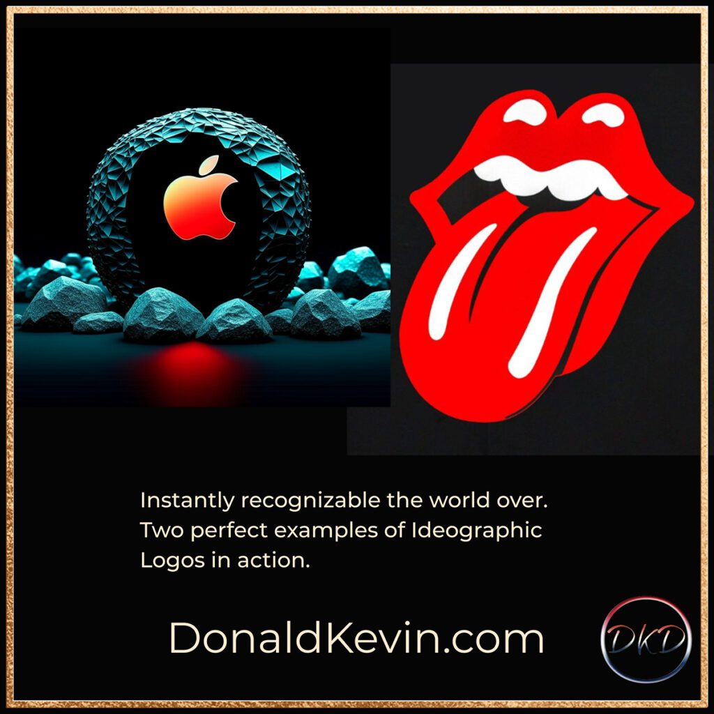
Ideographic logos, also known as pictorial or symbol logos, are once again capturing the imagination of graphic designers. These unique and visually striking logos replace traditional typographic elements with powerful and imaginative symbols that convey a brand’s essence in an artful way. By harnessing the power of symbols and icons, designers are able to distill complex concepts into a single image, making it easier for brands to leave a lasting impression on their audience.
What makes ideographic logos particularly exciting is their versatility. Their simplicity and ability to transcend language barriers make them a powerful tool for global brands. One iconic example is the Apple logo—an elegantly bitten apple that encapsulates the brand’s core values of innovation and simplicity. With Fall 2023’s renewed focus on ideographic logos, we can expect to witness a surge of creative and captivating symbols that will revolutionize brand identities.
As we move further in to Fall 2023, designers are experimenting with unconventional color schemes to breathe new life into their ideographic logos. Blending contrasting colors in unexpected ways adds a touch of excitement and intrigue to these symbols. From bold and vibrant gradients to sophisticated monochromatic combinations, designers have the freedom to push the boundaries and create unforgettable brand visuals. The fusion of unexpected colors will undoubtedly captivate consumers and solidify brand impressions.
Mixing Elements In Graphic Design
As art imitates life (or is it the other way around? I’m never quite sure), It’s no surprise to this writer that a diverse blend of elements is becoming the norm in graphic design. Designers are no longer limited to using a single style or inspiration. Instead, they are encouraged to mix and match different elements, such as textures, colors, and typography, to create unique and visually stunning designs. This trend allows for endless possibilities and opens up a world of creativity.
Mixing elements in graphic design enables designers to break free from traditional design rules and conventions. It allows them to explore new ways of combining contrasting elements to create a captivating visual experience. By combining unexpected elements, such as vintage and futuristic styles or hand-drawn illustrations with digital elements, designers can spark curiosity and surprise their audience.

This trend embraces the idea that opposites attract. By juxtaposing elements that are seemingly contradictory, designers can create a visually striking composition that demands attention. Mixing different textures, for example, can add depth and dimension to a design, making it more engaging and memorable. This approach encourages designers to think outside the box and challenge the norms of traditional graphic design.
To Sum It all Up:
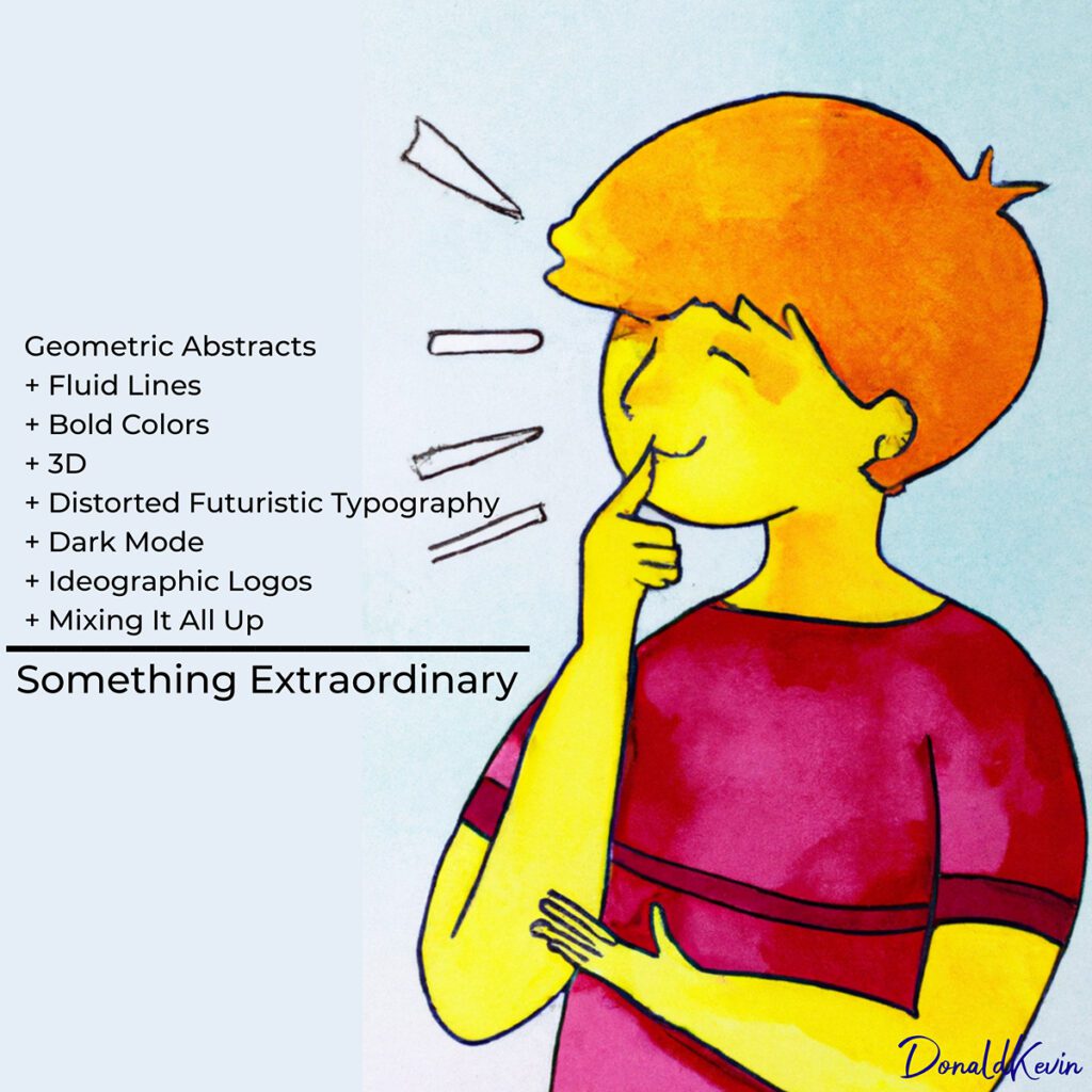
In this two-part series, we looked at fall 2023 trends. While not exhaustive, it should give you a good foundation on which to build. So go ahead, be bold, get creative, and go forward in confidence in your approach to graphic design. Use vibrant and bold colors, experiment with geometric lines, and add some fluidity of movement for diversity’s sake. Embrace the drama that dark mode creates and distort your text, even if only a little. Have fun! Thank you for visiting DonaldKevin.com. Stay groovy and CREATE!
