Color Trends 2024 For Print On Demand Part 2
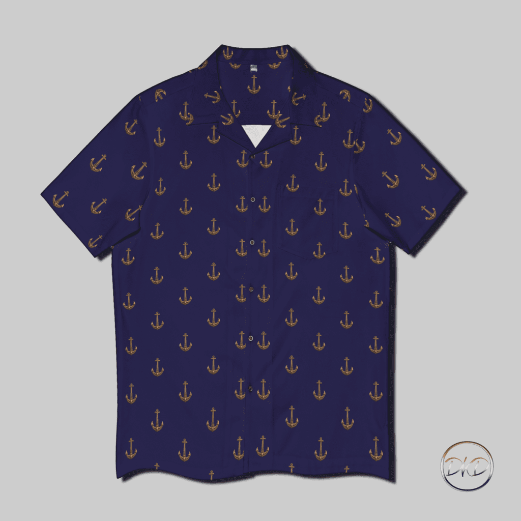
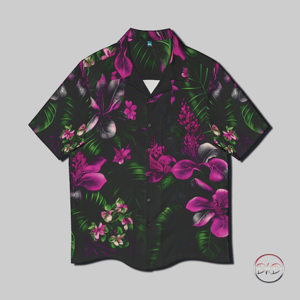
 Hey there and welcome to DonaldKevin.com and Color Trends 2024 For Print On Demand Part 2! In our last exploration trek of upcoming trends, we’ve delved into a rainbow of vibrant hues. From light blues to oranges, reds, and berry colors, we’ve left no shade untouched. But today, we’re diving into the depths of deep blues and purples, alongside the comforting neutrality of greys. So sit back, relax, and let’s continue our journey through the mesmerizing world of color trends for 2024. Welcome to part 2 of Color Trends 2024!
Are you ready to add a pop of color to your design projects in 2024? Look no further than pastel pinks! These soft, delicate shades are the perfect way to inject some warmth and femininity into your designs. Whether you’re working on a branding project, creating social media graphics, or designing a website, pastel pinks are a versatile choice that can work in a variety of contexts.
When it comes to using pastel pinks in graphic design, the key is to keep things light and airy. These shades are inherently soft and gentle, so they work best when paired with similarly muted colors. Think soft greys, pale blues, and creamy whites. This combination creates a tranquil, soothing aesthetic that is perfect for creating a sense of calm and relaxation in your designs.
One of the great things about pastel pinks is that they can be used in a variety of design styles. Whether you’re going for a modern, minimalist look or a more whimsical, playful feel, pastel pinks can adapt to suit your needs. They can add a touch of elegance and sophistication to a design, or they can be used to create a fun and lighthearted vibe.
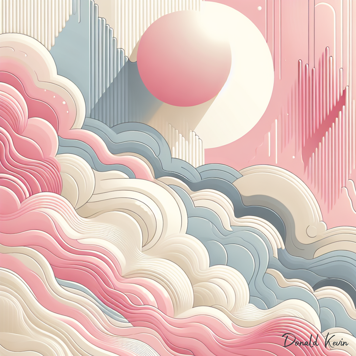
Incorporating pastel pinks into your designs is a great way to tap into the latest color trends for 2024. These shades are set to be everywhere in the coming year, so using them in your projects will ensure that your designs feel fresh and current. Whether you use pastel pinks as a main focal point or as an accent color, they are sure to bring a touch of charm and sweetness to your work.
So, if you’re looking to add a touch of sweetness and femininity to your designs in 2024, be sure to incorporate pastel pinks into your color palette. Whether you’re designing a logo, creating a social media post, or working on a website, pastel pinks are a versatile and on-trend choice that is sure to make your designs stand out. So go ahead, embrace the pink!
 Thanks for stopping by DonaldKevin.Com to check out the latest trends in graphic design for 2024. I sincerely hope you were inspired, learned something, and enjoyed diving into the world of deep blues, purples, neutral grays, and pastel pinks. Remember, experimenting and playing with these colors in your designs is the key to staying ahead of the game. So go ahead, let your creativity run wild and stay tuned for more tips, tricks, and design inspiration. Happy designing!