Color Trends 2024 For Print On Demand Part 2
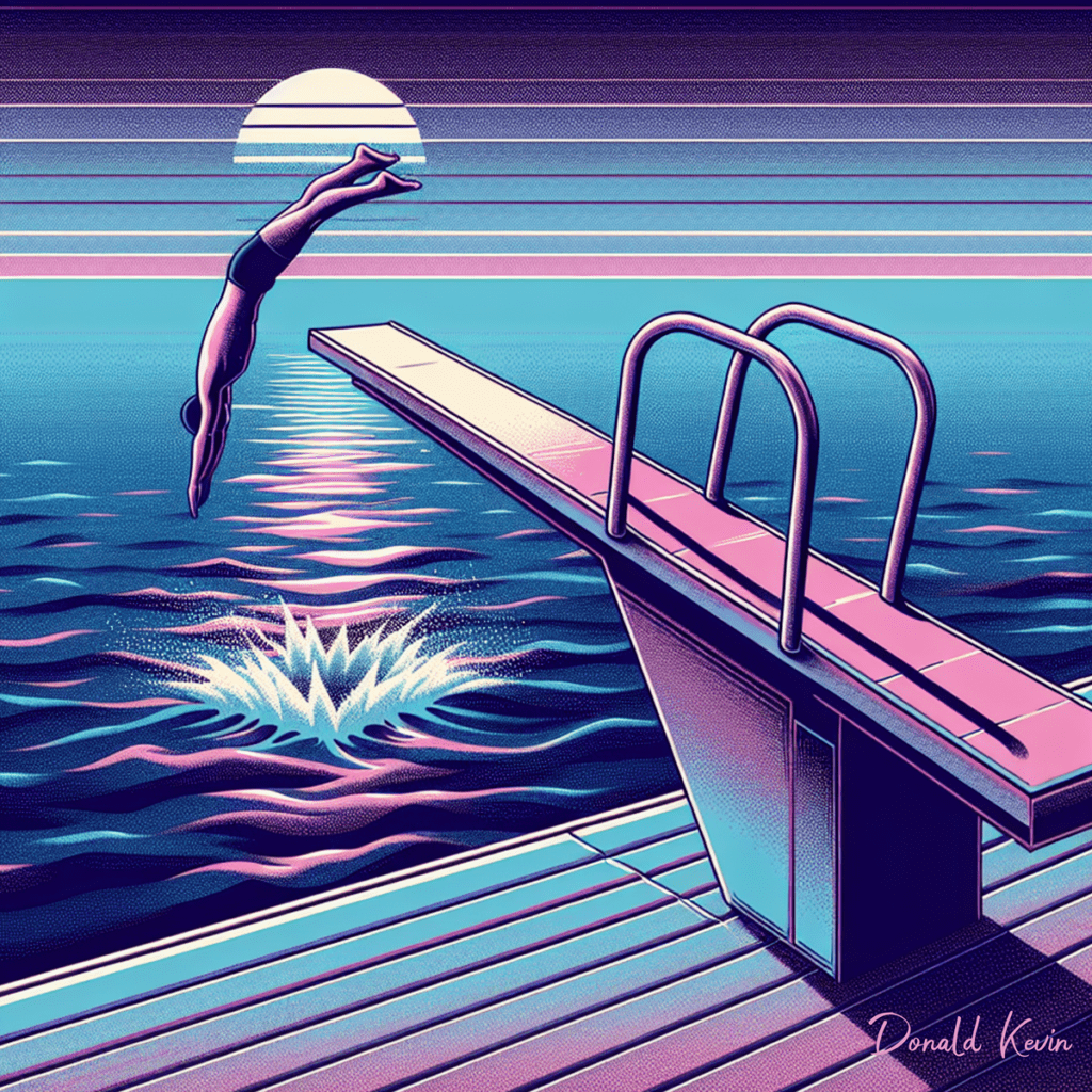 Hey there and welcome to DonaldKevin.com and Color Trends 2024 For Print On Demand Part 2! In our last exploration trek of upcoming trends, we’ve delved into a rainbow of vibrant hues. From light blues to oranges, reds, and berry colors, we’ve left no shade untouched. But today, we’re diving into the depths of deep blues and purples, alongside the comforting neutrality of greys. So sit back, relax, and let’s continue our journey through the mesmerizing world of color trends for 2024. Welcome to part 2 of Color Trends 2024!
Are you ready to add a pop of color to your design projects in 2024? Look no further than pastel pinks! These soft, delicate shades are the perfect way to inject some warmth and femininity into your designs. Whether you’re working on a branding project, creating social media graphics, or designing a website, pastel pinks are a versatile choice that can work in a variety of contexts.
When it comes to using pastel pinks in graphic design, the key is to keep things light and airy. These shades are inherently soft and gentle, so they work best when paired with similarly muted colors. Think soft greys, pale blues, and creamy whites. This combination creates a tranquil, soothing aesthetic that is perfect for creating a sense of calm and relaxation in your designs.
One of the great things about pastel pinks is that they can be used in a variety of design styles. Whether you’re going for a modern, minimalist look or a more whimsical, playful feel, pastel pinks can adapt to suit your needs. They can add a touch of elegance and sophistication to a design, or they can be used to create a fun and lighthearted vibe.
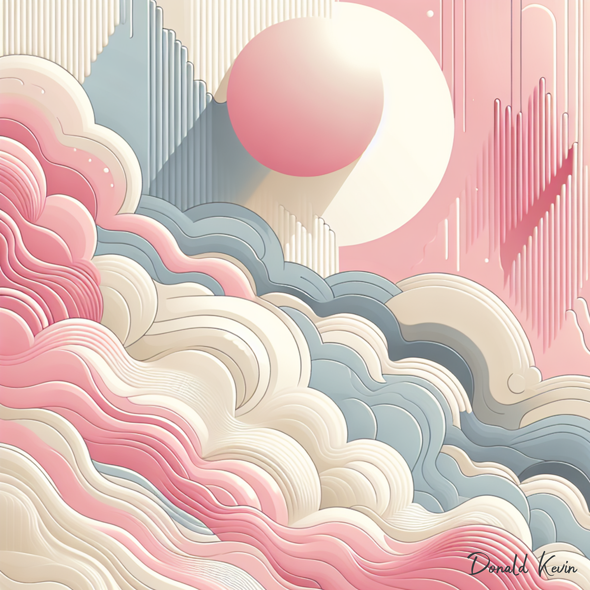
Incorporating pastel pinks into your designs is a great way to tap into the latest color trends for 2024. These shades are set to be everywhere in the coming year, so using them in your projects will ensure that your designs feel fresh and current. Whether you use pastel pinks as a main focal point or as an accent color, they are sure to bring a touch of charm and sweetness to your work.
So, if you’re looking to add a touch of sweetness and femininity to your designs in 2024, be sure to incorporate pastel pinks into your color palette. Whether you’re designing a logo, creating a social media post, or working on a website, pastel pinks are a versatile and on-trend choice that is sure to make your designs stand out. So go ahead, embrace the pink!
 Thanks for stopping by DonaldKevin.Com to check out the latest trends in graphic design for 2024. I sincerely hope you were inspired, learned something, and enjoyed diving into the world of deep blues, purples, neutral grays, and pastel pinks. Remember, experimenting and playing with these colors in your designs is the key to staying ahead of the game. So go ahead, let your creativity run wild and stay tuned for more tips, tricks, and design inspiration. Happy designing!
 One of the standout colors for 2024 is Cornsilk. This soft, warm shade is reminiscent of the pale yellow of the silk fibers of corn. If you’ve ever watched your mom shucking corn and cleaning the fibers in the kitchen, you know what I’m talking about. It exudes a sense of warmth and comfort, maybe even evoking a sense of nostalgia, making it perfect for cozy loungewear, bedding, and home décor items. Incorporating Cornsilk into your print-on-demand products can add a touch of elegance and sophistication to any project.
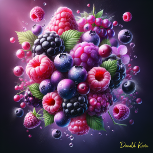 Summer is in full swing as berry tones are making their luscious presence felt, adding richness and depth to any design. From deep purples to vibrant pinks, Berry colors can evoke a sense of luxury and opulence, and as with cornsilk, can evoke a nostalgic feeling (does the smell of a Berry pie in the oven ring any bells?). Consider using Berry shades in your print on demand products such as apparel, accessories, and home goods to create a bold and eye-catching statement.
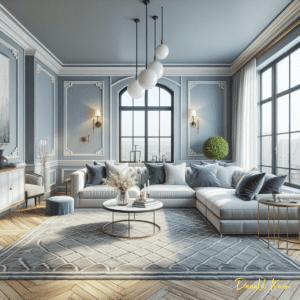 Light Blue is a classic color that never goes out of style. In 2024, this serene hue is taking center stage in the print on demand industry. Light Blue evokes a sense of calm and tranquility, making it perfect for products that promote relaxation and mindfulness. Incorporate Light Blue into your designs to create a sense of peace and harmony.
 Natural earth tone colors are always in vogue, and 2024 is no exception. From earthy browns to mossy greens, natural shades bring a sense of grounding and connection to the outdoors. Incorporating natural colors into your print-on-demand products can create a sense of sustainability and eco-friendliness, appealing to conscious consumers who value environmental responsibility.
 Orange is a bold and vibrant color that is set to dominate the print on demand industry in 2024. This energetic hue exudes warmth and positivity, making it perfect for products that evoke a sense of happiness and joy. Incorporate Orange into your designs to create a sense of vitality and enthusiasm that will attract customers looking for a pop of color in their lives.
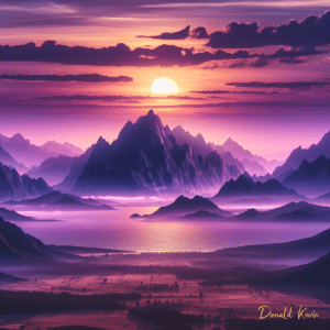 Purple is a regal and luxurious color that is doing big things in 2024. From deep amethysts to light lavenders, Purple shades add a sense of sophistication and elegance to any design. Incorporating Purple into your print on demand products can create a sense of opulence and refinement, appealing to customers who appreciate luxury and style
 Red is a classic color that never goes out of style. In 2024, this fiery hue is making a bold statement in the print on demand industry. Red exudes passion and energy, making it perfect for products that demand attention and make a statement. Incorporate Red into your designs to create a sense of power and confidence that will attract customers looking to stand out from the crowd.
 While it may seem counterintuitive, adding constraints to your design process can actually help you think more creatively. Limiting your color palette, typography choices, or design elements can force you to think outside the box and come up with unique solutions. Embracing constraints can push you to explore different approaches and find new ways to express your creativity. Setting deadlines and goals for your projects can help you push through a creative block. Having a clear timeline for when you need to complete a project can motivate you to get started and keep you on track. Break down your project into smaller, manageable tasks and set deadlines for each one. This can help you stay on target, focused and productive, even when you’re feeling creatively blocked.
 When you’re struggling to develop new ideas, looking to other artists for inspiration can be helpful. Sometimes seeing the amazing creations of others can kickstart your creativity and give you new ideas to work with. Whether it’s checking out a new art exhibit, browsing through a magazine, or scrolling through Instagram, there are countless ways to find inspiration from fellow creatives. Browse through design magazines, visit art galleries, or follow your favorite graphic designers on social media. Taking inspiration from others can help you see things from a different perspective and spark your creativity.
 Keeping an idea book handy can be a great way to overcome creative blocks. When you have an idea, write it down. When you’re stuck for ideas, try sketching out rough concepts and doodles in your idea book. Writing ideas down or drawing by hand can help you loosen up creatively and explore new possibilities. Plus, flipping through your idea book can inspire future projects. It can also give old ideas new life.
 Taking care of yourself is essential for maintaining creativity and productivity. Make sure you’re getting enough sleep, eating well, and exercising regularly. Engage in activities that relax and rejuvenate you, such as reading, listening to music, yoga, meditation or prayer, or spending time in nature. By prioritizing self-care, you can improve your overall well-being and creativity.
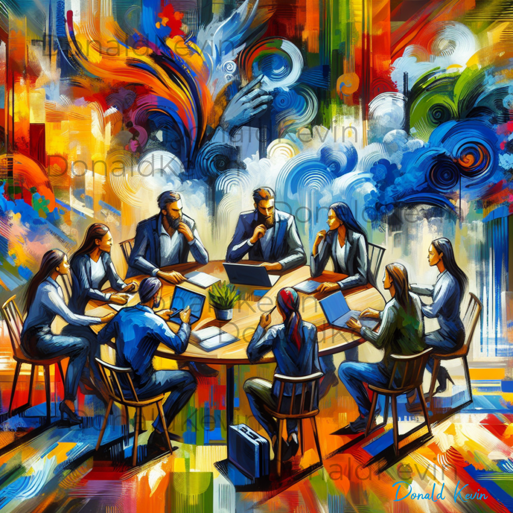
 Hey there, fellow creative minds! Welcome to DonaldKevin.com and Making Money In Graphic Design Part Two. Ready to dive back into the exciting world of graphic design and how it can help you earn some extra cash? Well, you’re in luck because today is the second installment of the series on making money in graphic design. In this post, we’ll be exploring the wonderful world of online marketplaces, specifically Etsy, Shopify, and WooCommerce. So, whether you’re a seasoned graphic designer or just starting out, grab a cup of your favorite coffee and get ready to discover some fantastic ways to turn your creative treasures into cold hard cash!

 While it is essential to have a basic understanding of design principles, it is equally necessary to know when and how to break them. In graphic design, rules are meant to be challenged, allowing designers to explore new territories and create visually stunning pieces. By embracing chaos and incorporating unconventional elements, designers can create designs that stand out from the crowd.
 While breaking the rules in graphic design can lead to innovative and memorable creations, it is important to strike a balance. It is crucial to understand the fundamental principles of design before intentionally breaking them. This knowledge enables designers to make informed decisions and ensures that their work remains visually appealing and effective. By consciously bending the rules rather than completely disregarding them, designers can create designs that captivate the audience while still conveying the desired message.
 The grid is a fundamental principle of graphic design, providing structure and organization. However, pushing its boundaries can result in groundbreaking designs that capture attention. By breaking free from the confines of a strict grid, designers can create compositions that are visually dynamic and unexpected. This approach allows for greater creativity and experimentation, leading to designs that break the mold and become iconic. Embracing asymmetry, overlapping elements, and unconventional layouts can help designers push the boundaries of the grid and create designs that are truly remarkable.
 Negative space, often overlooked, is an excellent opportunity for breaking graphic design rules. By intentionally allowing blank spaces in a design, designers can create a sense of balance, simplicity, and elegance. Negative space highlights the main elements of a design and guides the viewer’s attention, resulting in visually striking and iconic designs.
 Breaking the rules in graphic design is a powerful way to create iconic designs that leave a lasting impression. By pushing the boundaries of traditional design principles, designers can explore new territories, experiment with unconventional elements, and captivate their audience with visually stunning artwork. Through typography techniques, daring color choices, strategic use of negative space, and incorporating mixed media, designers can create designs that defy expectations and make a significant impact. So, go ahead, break the graphic design rules, and unleash your creativity to create iconic designs that stand the test of time. Thank you so much for taking the time to stop by today. Stay Groovy and CREATE!
 Hey there! Donald Kevin here, thank you for visiting, and welcome to “Unleashing Creativity: Graphic Design Trends Fall 2023 Part 2.” Are you ready to step into the future? Well, buckle up because in this week’s blog post, we are diving deep into the exciting world of graphic design trends for Fall 2023!


 Get ready to step outside the traditional color palette! Fall 2023 is all about embracing bold and vibrant colors that instantly catch the eye and make a powerful statement. Think electric blues, neon greens, and fiery oranges that add an unexpected pop to your designs. These eye-catching shades inject a dose of energy and life into your compositions, leaving a lasting impression on your audience. Buckle up and get ready to unleash your creativity with this exciting trend!
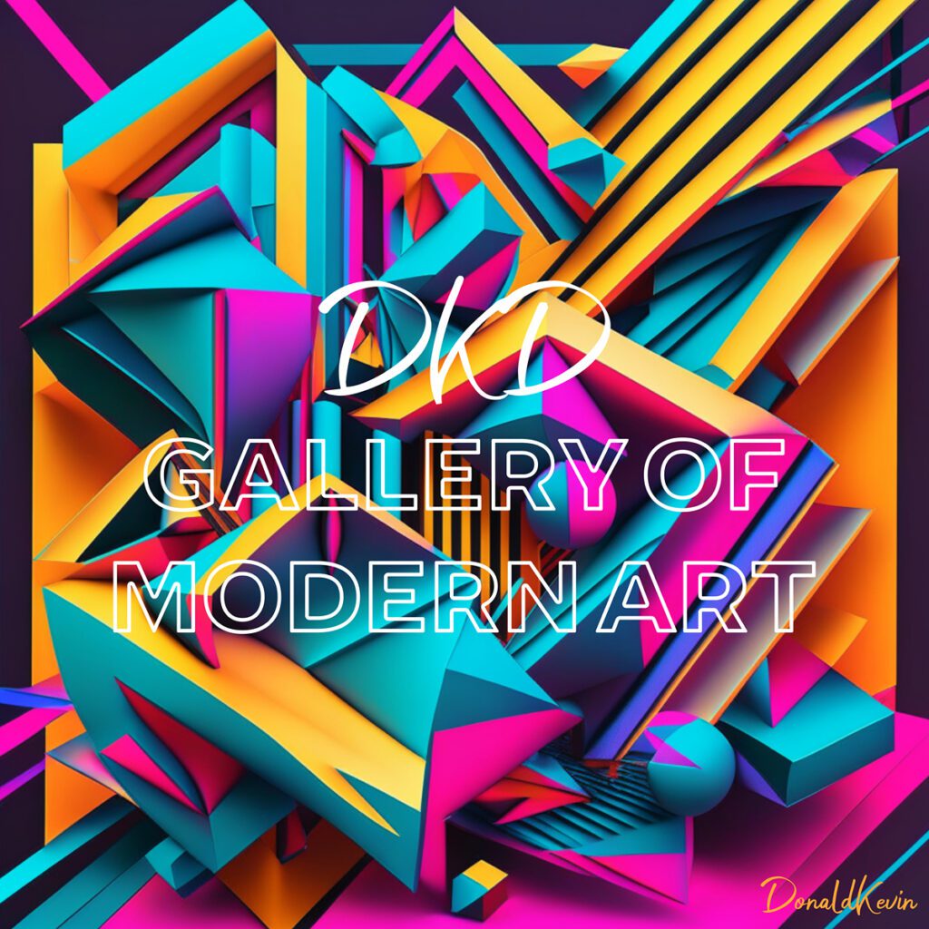
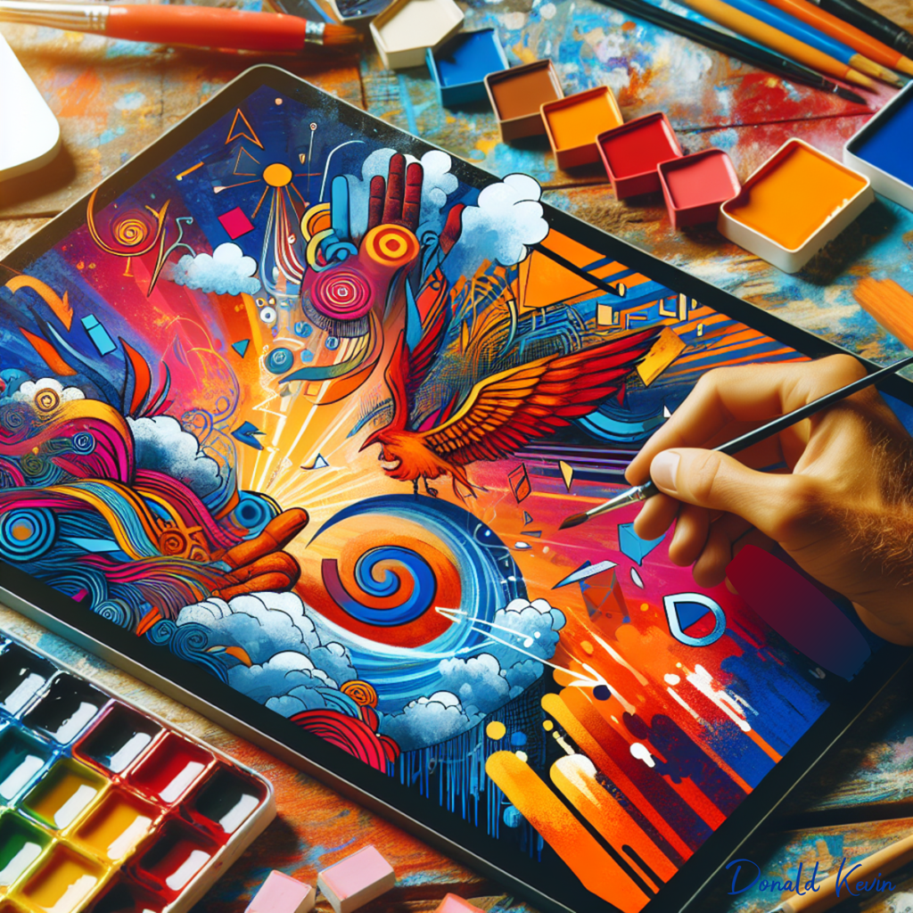
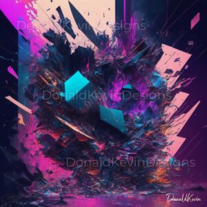
 The use of 3D and abstract illustrations in graphic design offers endless possibilities for creating eye-catching and immersive visuals. As graphic designers we have the ability to experiment with unique perspectives, textures, and dimensions, that can result in striking compositions that captivate the viewer’s attention. Think of a surreal landscape popping out of your screen or a product showcasing its intricate details, almost as if you can see it from all angles. These illustrations bring depth and a sense of realism to the otherwise ordinary, and designers are embracing this exciting medium with open arms.

 Consistency is another key aspect to creating eye-catching social media posts. By maintaining a consistent style, color palette, and overall aesthetic, you can help build brand awareness and recognition among your audience. When followers see a post from your brand on their feed, they should be able to immediately recognize it as yours simply by the look and feel. This consistency not only creates a cohesive visual identity for your brand but also helps to establish trust and credibility.
 In addition to design consistency, it’s also important to maintain a consistent tone of voice across your social media posts. This refers to the way you communicate with your audience and the language you use. Whether you want to be playful and lighthearted or professional and informative, it’s essential to choose a tone that aligns with your brand’s overall personality. Using consistent language and tone helps to establish a sense of familiarity and builds a stronger connection with your audience.
