Unlocking the Secrets of Typography: Using Typeface Part 2
 Hey there and welcome to DonaldKevin.com. Since I posted an article last week, Graphic Design 101: Tips and Tricks For Beginners, I thought I’d continue on this path and write a little more about typography. I posted an article a few weeks back touching on the subject of using typeface in graphic design and thought I’d take it a little further this week. You can read that article here >>>> Using Typeface <<<<
 Typography plays a crucial role in graphic design, yet it often goes unnoticed. It is the unsung hero that can make or break the visual appeal and effectiveness of any design. Understanding the power of typography is essential for designers who want to create stunning visuals that capture attention and convey a message effectively. In this article, we will explore the art of using typography in graphic design, delve into the difference between fonts and typefaces, uncover the secrets of finding contrasting typefaces, and discuss which typefaces work best for headings and text bodies.
The Art Of Using Typography In Graphic Design:
Typography refers to the visual arrangement of text, including the choice of fonts, sizes, spacing, and formatting. It is a powerful tool that can enhance the readability, personality, and overall impact of a design. Whether it’s a logo, website, or brochure, typography can communicate the mood, tone, and message of a brand or product.
Fonts vs. Typefaces:
 Before we dive deeper into the importance of typography in graphic design, it’s crucial to understand the difference between fonts and typefaces. In simple terms, a typeface is a design concept that includes a range of fonts within it. Fonts, on the other hand, are the individual styles within a typeface, such as bold, italic, or regular. For example, Montserrat is a typeface, and Montserrat Regular and Montserrat Bold are fonts within that typeface. As a matter of fact, Montserrat is the typeface I use for the text body of my articles. I love it. It’s one of my favorites. And you thought Montserrat was just a vacation destination.
Finding Contrasting Typefaces:
 One of the secrets to creating visually appealing designs is to use contrasting typefaces. Contrasting typefaces add visual interest, balance, and hierarchy to your design. When selecting contrasting typefaces, there are a few key factors to consider:
1️⃣ Contrast in style: Choose typefaces that have distinct styles to create a clear differentiation between headings, subheadings, and body text. For instance, pairing a bold and modern typeface with a more traditional and elegant one can create a visually striking contrast.
2️⃣ Contrast in weight: Varying the weight of typefaces within your design adds depth and emphasis. Using a bold typeface for headings and a lighter one for body text can create a pleasing contrast that guides the reader’s eye through the content.
3️⃣ Contrast in size: Font size plays a crucial role in visual hierarchy. Large, bold fonts for headings, moderate-sized fonts for subheadings, and smaller fonts for body text are effective in creating an easy-to-follow reading experience.
Best Typefaces For Headings:
When it comes to selecting typefaces for headings, the goal is to grab attention and make a bold statement. Here are a few typefaces that work best for headings:
1️⃣ Impact: This bold, attention-grabbing typeface is perfect for headlines that need to make an impact. Hence the name Impact.
2️⃣ Futura: With its clean and modern look, Futura is often used for headings in sleek and minimalistic designs.
3️⃣ Baskerville: If you’re aiming for a more elegant and classic look, Baskerville can lend a touch of sophistication to your headings. This is my personal favorite for headings and any time that I want to convey a sense of authority. It conveys a sense of tradition as well. To quote Angela Channing from Falcon Crest “Tradition bears weight!”
Best Typefaces For Text Bodies:
For text bodies, legibility and readability are key considerations. Here are a few typefaces that work well for longer paragraphs:
1️⃣ Garamond: This timeless typeface is known for its excellent legibility, making it ideal for body text in print materials.
2️⃣ Arial: As a widely available and versatile sans-serif font, Arial is a popular choice for web-based designs.
3️⃣ Times New Roman: Despite being considered a default choice, Times New Roman remains a reliable option for body text due to its familiarity and readability.
4️⃣ Montserrat: Using the Montserrat typeface in graphic design is a fantastic choice for creating sleek and modern designs. This versatile and elegant font adds a touch of professionalism to any project. With its clean lines and elegant curves, Montserrat typeface stands out and grabs attention.
Whether it’s for a logo, website, or print materials, incorporating Montserrat typeface instantly elevates the overall aesthetic. I love using it for designs where I want a touch of Art Deco. its lines and curves are perfect for it. And it’s my choice of typeface for this website. Baskerville headings and Montserrat body text.
In Conclusion:
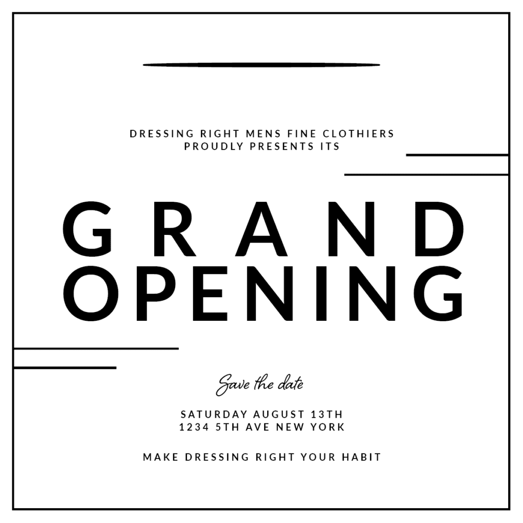
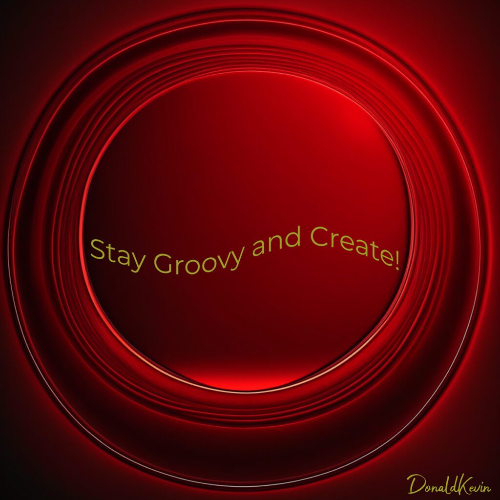
Typography is way more important than we give it credit for in graphic design. It’s like the unsung hero that quietly takes our designs to a whole new level. When we understand the art of typography and its influence on how visually appealing, readable, and organized our designs are, we can work some serious magic. From picking typefaces that contrast each other perfectly, to making sure they fit the overall vibe we want to convey, mastering the use of type is like finding the key to unlock the designer’s ultimate potential. As you can see in the before and after examples below, adding typeface takes the image to another level.


Choosing the right typeface in  graphic design is like finding the perfect ingredient for a recipe. It sets the whole tone and vibe of your design. Whether you’re going for something elegant and refined or loud and edgy, the typeface you choose can make all the difference. Picture it like picking the right outfit for a specific occasion. You wouldn’t wear a suit to the beach, right? Same goes for typography. It’s all about finding the perfect match for the overall look and feel you want to achieve.
The secret of using type effectively lies in understanding the impact it has on the hierarchy and readability of your design. It’s not just about making things look pretty, it’s about guiding the viewer’s eye and making information easily digestible. Think of it as laying out a roadmap for the reader. You want to make sure that the most important information is highlighted and easily accessible, while still maintaining a pleasing visual balance. So, don’t underestimate the power of using type in graphic design, because when done right, it can elevate your designs from ordinary to extraordinary.

Again many thanks for stopping by. It’s been my pleasure to serve you. I hope I’ve served you well.
