The Fundamentals Of Composition and Layout Part 2
 Hey there and thank you for visiting DonaldKevin.com. Are you ready to take your graphic design skills to the next level? Do you want to create visually captivating designs that leave a lasting impact on your audience? Look no further! Today, we’ll open our treasure chest of secrets and discover the fascinating world of composition and layout in graphic design part two, uncovering the secrets of using grids, alignment, repetition, and contrast. By mastering these fundamental principles, you can transform your designs into powerful stories that capture attention, convey messages effectively, and elevate your brand.
There are various types of grids you can experiment with, each offering unique possibilities and advantages. Let’s take a closer look at a few popular grid types:
 Modular Grid: This grid is based on a series of equally spaced columns and rows, creating a harmonious structure ideal for organizing large amounts of information. It is commonly used in magazine layouts, websites, and catalogs.
Hierarchical Grid: As the name suggests, this grid type emphasizes a clear visual hierarchy. By assigning different levels of importance to different sections of your design, you can guide the viewer’s attention and create a more engaging experience.
Manuscript Grid: This grid is commonly used in print media and mimics the layout of a book or manuscript. It is particularly useful for long-form content such as articles, essays, or reports, as it provides a comfortable reading experience.
Now, let’s explore how grids relate to margins. Margins are the white space surrounding your design, acting as a buffer zone that separates the content from the edges of the canvas. They play a vital role in maintaining a sense of balance and harmony within your design. Here’s a breakdown of the top and bottom margins:
 Top Margin: The top margin serves as an anchor, creating visual stability and giving your design a clear starting point. It is often used to accommodate headers, logos, or any other elements that need to be consistently present at the top of your design.
Bottom Margin: The bottom margin, on the other hand, provides a sense of closure and visual rest. It prevents your design from feeling cramped or cluttered, ensuring that your content is neatly contained within the canvas.
By understanding the relationship between grids and margins, you can create designs that are visually balanced, aesthetically pleasing, and easy to comprehend.
Imagine reading a book where the text is scattered across the pages without any order or structure. It would be chaotic and frustrating, right? The same principle applies to graphic design. Alignment plays a crucial role in giving your designs structure and creating a visually pleasing experience for your audience. Alignment refers to the arrangement of elements in a design along a common axis or edge. It helps establish a sense of order, making your designs easier to read, understand, and navigate. Whether you’re designing a website, brochure, logo, or social media post, alignment is key.
There are four primary types of alignment that you can utilize:
Left Alignment: This is the most commonly used alignment in design. It creates a clean and organized look, allowing the eye to smoothly scan from left to right. Left alignment is particularly effective for text-heavy designs such as blog posts, newsletters, and reports.
Sometimes you’ll want to use a right alignment instead, depending on where you want your image (if there is one) placed.
Center Alignment: Center alignment adds a touch of elegance and symmetry to your designs. It works wonders for headings, subheadings, and short blocks of text. However, be cautious when using center alignment for long paragraphs, as it can make them challenging to read.
Justified Alignment: Justified alignment aligns both the left and right edges of your text. It creates a neat and balanced appearance, providing a structured and formal feel to your designs. Justified alignment is often used in newspapers, magazines, and formal documents.
Have you ever noticed how professional designs appear cohesive and well-thought-out? It’s all thanks to the power of repetition. Repetition is a graphic design fundamental that involves using similar elements throughout your design to create cohesiveness and establish a visual hierarchy.
When we talk about repetition, we’re referring to elements such as typeface, fonts, body copy, lines, colors, and even shapes. By repeating these elements strategically, you form a connection between different elements and create a unified visual language. Another key element in graphic design.
Imagine a website where each page has a different font, color scheme, and style. It would be disorienting and chaotic. Repetition brings order to your designs, making them pleasing to the eye and easy to navigate. It allows your audience to quickly recognize patterns and understand the relationships between different elements.
Furthermore, repetition adds a touch of professionalism to your work. By consistently using your brand’s colors, fonts, and style, you create a strong visual identity that helps people identify and remember your brand. This consistency fosters trust and brand recognition, making your designs more memorable and impactful.
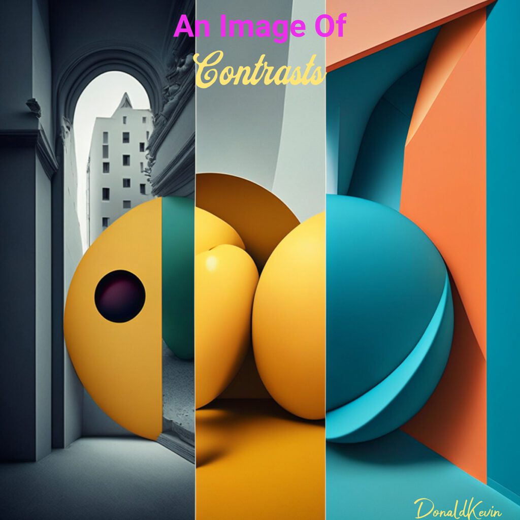
 Add Some spice to your design. Imagine a world where everything is the same color, size, and shape. Bland and uninteresting, right? Contrast, on the other hand, adds excitement and visual interest to your designs. It’s the spice that makes your work stand out from the crowd. Let contrast be the salt in your design stew.
Contrast can be achieved in various ways:
Black and White and Color Contrast: One of the most classic forms of contrast, the stark difference between black and white elements creates a strong visual impact. It helps direct attention, highlight important information, and create a sense of drama. The use of contrasting colors will add visual interest to a design as well.
Big and Small Contrast: Playing with varying sizes of elements creates a striking visual hierarchy. By making certain elements larger or smaller, you can guide your audience’s eyes and emphasize important elements.
 In conclusion, composition and layout in graphic design are vital fundamentals that can make or break the success of your visual communication. By understanding and implementing the principles of alignment, repetition, and contrast, you can take your designs to new heights, captivating your audience and leaving a lasting impression.
Whether you’re a small business owner striving to enhance your brand’s visuals, a student eager to excel in graphic design, a blogger looking to captivate your readers, or a teacher, marketer, hobbyist, or entrepreneur seeking to level up your design skills, mastering composition and layout will undoubtedly propel you forward.
So, take a leap of faith, experiment, and unleash your creativity. Your designs have the power to inspire, inform, and influence. Embrace the graphic design fundamentals explored today, and let your imagination soar!
 If you have any questions or need further guidance on composition and layout in graphic design, please feel free to contact me. I would love to hear from you and am here to support and assist you on your design journey. Click Here To Connect
Wishing you boundless creativity and success!
Stay groovy and thanks for stopping by!