Unlocking the Secrets of Typography: Using Typeface Part 2
 Hey there and welcome to DonaldKevin.com. Since I posted an article last week, Graphic Design 101: Tips and Tricks For Beginners, I thought I’d continue on this path and write a little more about typography. I posted an article a few weeks back touching on the subject of using typeface in graphic design and thought I’d take it a little further this week. You can read that article here >>>> Using Typeface <<<<
 Typography plays a crucial role in graphic design, yet it often goes unnoticed. It is the unsung hero that can make or break the visual appeal and effectiveness of any design. Understanding the power of typography is essential for designers who want to create stunning visuals that capture attention and convey a message effectively. In this article, we will explore the art of using typography in graphic design, delve into the difference between fonts and typefaces, uncover the secrets of finding contrasting typefaces, and discuss which typefaces work best for headings and text bodies.
The Art Of Using Typography In Graphic Design:
Typography refers to the visual arrangement of text, including the choice of fonts, sizes, spacing, and formatting. It is a powerful tool that can enhance the readability, personality, and overall impact of a design. Whether it’s a logo, website, or brochure, typography can communicate the mood, tone, and message of a brand or product.
Fonts vs. Typefaces:
 Before we dive deeper into the importance of typography in graphic design, it’s crucial to understand the difference between fonts and typefaces. In simple terms, a typeface is a design concept that includes a range of fonts within it. Fonts, on the other hand, are the individual styles within a typeface, such as bold, italic, or regular. For example, Montserrat is a typeface, and Montserrat Regular and Montserrat Bold are fonts within that typeface. As a matter of fact, Montserrat is the typeface I use for the text body of my articles. I love it. It’s one of my favorites. And you thought Montserrat was just a vacation destination.
Finding Contrasting Typefaces:
 One of the secrets to creating visually appealing designs is to use contrasting typefaces. Contrasting typefaces add visual interest, balance, and hierarchy to your design. When selecting contrasting typefaces, there are a few key factors to consider:
1️⃣ Contrast in style: Choose typefaces that have distinct styles to create a clear differentiation between headings, subheadings, and body text. For instance, pairing a bold and modern typeface with a more traditional and elegant one can create a visually striking contrast.
2️⃣ Contrast in weight: Varying the weight of typefaces within your design adds depth and emphasis. Using a bold typeface for headings and a lighter one for body text can create a pleasing contrast that guides the reader’s eye through the content.
3️⃣ Contrast in size: Font size plays a crucial role in visual hierarchy. Large, bold fonts for headings, moderate-sized fonts for subheadings, and smaller fonts for body text are effective in creating an easy-to-follow reading experience.
Best Typefaces For Headings:
When it comes to selecting typefaces for headings, the goal is to grab attention and make a bold statement. Here are a few typefaces that work best for headings:
1️⃣ Impact: This bold, attention-grabbing typeface is perfect for headlines that need to make an impact. Hence the name Impact.
2️⃣ Futura: With its clean and modern look, Futura is often used for headings in sleek and minimalistic designs.
3️⃣ Baskerville: If you’re aiming for a more elegant and classic look, Baskerville can lend a touch of sophistication to your headings. This is my personal favorite for headings and any time that I want to convey a sense of authority. It conveys a sense of tradition as well. To quote Angela Channing from Falcon Crest “Tradition bears weight!”
Best Typefaces For Text Bodies:
For text bodies, legibility and readability are key considerations. Here are a few typefaces that work well for longer paragraphs:
1️⃣ Garamond: This timeless typeface is known for its excellent legibility, making it ideal for body text in print materials.
2️⃣ Arial: As a widely available and versatile sans-serif font, Arial is a popular choice for web-based designs.
3️⃣ Times New Roman: Despite being considered a default choice, Times New Roman remains a reliable option for body text due to its familiarity and readability.
4️⃣ Montserrat: Using the Montserrat typeface in graphic design is a fantastic choice for creating sleek and modern designs. This versatile and elegant font adds a touch of professionalism to any project. With its clean lines and elegant curves, Montserrat typeface stands out and grabs attention.
Whether it’s for a logo, website, or print materials, incorporating Montserrat typeface instantly elevates the overall aesthetic. I love using it for designs where I want a touch of Art Deco. its lines and curves are perfect for it. And it’s my choice of typeface for this website. Baskerville headings and Montserrat body text.
In Conclusion:
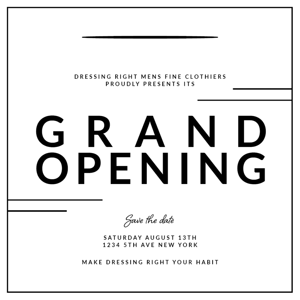
Typography is way more important than we give it credit for in graphic design. It’s like the unsung hero that quietly takes our designs to a whole new level. When we understand the art of typography and its influence on how visually appealing, readable, and organized our designs are, we can work some serious magic. From picking typefaces that contrast each other perfectly, to making sure they fit the overall vibe we want to convey, mastering the use of type is like finding the key to unlock the designer’s ultimate potential. As you can see in the before and after examples below, adding typeface takes the image to another level.


Choosing the right typeface in  graphic design is like finding the perfect ingredient for a recipe. It sets the whole tone and vibe of your design. Whether you’re going for something elegant and refined or loud and edgy, the typeface you choose can make all the difference. Picture it like picking the right outfit for a specific occasion. You wouldn’t wear a suit to the beach, right? Same goes for typography. It’s all about finding the perfect match for the overall look and feel you want to achieve.
The secret of using type effectively lies in understanding the impact it has on the hierarchy and readability of your design. It’s not just about making things look pretty, it’s about guiding the viewer’s eye and making information easily digestible. Think of it as laying out a roadmap for the reader. You want to make sure that the most important information is highlighted and easily accessible, while still maintaining a pleasing visual balance. So, don’t underestimate the power of using type in graphic design, because when done right, it can elevate your designs from ordinary to extraordinary.
Again many thanks for stopping by. It’s been my pleasure to serve you. I hope I’ve served you well.

 Color Theory: Colors can evoke emotions and set the mood for your design. Understanding the basics of color theory will help you create harmonious and eye-catching designs. You can read more about color theory here >>>
  2. Typography: The choice of typeface and fonts can significantly influence the overall look and feel of your design. Experiment with different typography styles to find the perfect match for your project. You can read more about using typeface here >>>>
  3. Layout: How you arrange elements on a page is crucial. A good layout ensures visual hierarchy and enables viewers to navigate the design effortlessly. You can read more about layout here >>>>
  4. Contrast and Balance: Balance refers to the visual weight distribution in your design. Contrast helps create visual interest and ensures that important elements stand out. You can read more about contrast and balance here >>>>
 5. Use of Space: Negative space, also known as white space, is as important as the elements you include in your design. Proper use of space helps create emphasis and gives your design room to breathe. You can read more about the use of space here >>>>
 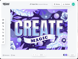 With Kittl’s intuitive interface, you can effortlessly create stunning designs by simply dragging and dropping elements onto the canvas. Seamlessly edit and customize text, colors, and images to suit your creative vision. Plus, Kittl’s diverse collection of templates and design assets will give you endless inspiration and speed up your workflow. So, get started today and explore the endless possibilities that Kittl brings to the table! You can grab Kittl here >>>>
  Canva is an online graphic design platform that offers a user-friendly interface and a wide range of design templates. To be honest I’ve only used Canva a few times. I enjoyed it when I used it, but haven’t used it that often. The reason I put it in here is that I have used it and it’s pretty straightforward, and people that I respect as graphic designers use it and they recommend it. You might find Canva to be an ideal starting point for you. You can grab Canva here >>>>
  In addition to the above-mentioned graphic design tools I also use and recommend Adobe products such as Photoshop, InDesign, and Illustrator with the following caveat…If you’re a beginning graphic designer you may want to prepare yourself for times of frustration and hair-pulling. There is a course that I’ve taken called How To Graphic Design: The Course Of Fundamentals that has step-by-step video tutorials that help to ease your frustration. Check out the video at the end of the article for more information on the course.
  Embarking on a journey in graphic design is an exciting and fulfilling endeavor. By understanding the fundamental principles, utilizing the right tools, and implementing the tips and tricks mentioned in this article, you’ll be well on your way to becoming a proficient graphic designer. Remember to enjoy the process, embrace experimentation, and never stop learning. With dedication and practice, you’ll soon be creating beautiful and
  These unique styles have left their enduring mark on graphic design, allowing artists to express their creativity and captivate audiences in distinct ways. And that is the goal – to captivate and be distinctive to your audience. Ain’t it fun? Let’s unravel some brief history, characteristics, and influences of each style, and explore their significance in the realm of graphic design. Let’s get inspired!


 The Bauhaus style finds its strength in its focus on functionality and simplicity. By utilizing basic shapes and a limited color palette, Bauhaus design manages to communicate messages effectively without unnecessary embellishments. It does away with the surplus and distills designs to their core elements, resulting in visuals that are both modern and timeless. This style’s ability to effectively convey information has made it a staple in various disciplines, from furniture design to typography and, of course, graphic design.
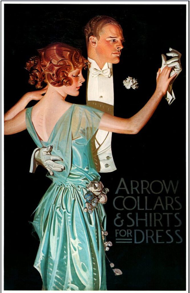
 I loved the majestic drama of a storm brewing on the horizon, or beautiful flowers in a garden and strong stately trees as a child. Still do. I thought (and still do) that God was truly the greatest artist. I can also remember, as a young man how much I loved the artistry of J.C Leyendecker and his influence in the world of Art Deco as well as Alphonse Mucha and his work as it related to the Art Nouveau movement.
 Timeless Elegance defines Art Deco, a style that emerged in the 1920s. Luxury, elegance, and modernism combined to create stunning visuals expressed in geometric patterns, streamlined forms, stark lines, and bold colors. A feast for the eyes to be sure. Explore the world of Art Deco and you’ll discover how it has influenced architecture, interior design, and fashion. You’ll see how these were

 If you like grandeur and splendor displayed in intricate lines and forms then The Baroque Style of art is for you. The Baroque era, spanning from the early 17th to the mid-18th century, marked a period of unprecedented artistic innovation. Originating in Rome, Italy, the Baroque movement quickly spread across Europe, leaving an indelible mark on various art forms, including architecture, sculpture, painting, and yes, graphic design.
 In conclusion, the world of design is a tapestry woven with the threads of various art movements. By immersing ourselves in the captivating history and influences of Art Deco, Baroque, Art Nouveau, J.C. Leyendecker, and the Arrow Clothing Line, we can gain a deeper understanding of the power of design and its impact on different mediums.
  and how the color tones, tints, and shades were mesmerizing to me. The same for the television show “Family Affair” (some of you may have to Google it) and how it’s opening was so very colorful. The tones were monochromatic which gave a sense of light, playful sophistication. Such is the power of color. In a continuation of last week’s post, we’re going to get into shades, tints, and tones, tips and tricks,
  For instance, the use of complementary colors can create a harmonious and balanced composition, while analogous colors can establish a sense of unity and coherence. Additionally, the careful consideration of color psychology can enhance the effectiveness of your designs. Understanding how different colors evoke specific emotions or associations can help you elicit the desired response from your audience.
  Now, let’s dive into some tips and tricks for perfecting your color palette and getting you on target. Start by considering the purpose and target audience of your design. Are you aiming for a youthful and energetic vibe, or a sophisticated and elegant feel? Once you have a clear direction, explore different color combinations and experiment with their placement and
  To inspire your creative journey, let us share some examples of how color can transform designs across various industries. Imagine a sleek and modern website for a tech startup, where a simple use of contrasting shades of blue creates a sense of trustworthiness and reliability. Or envision a lively and playful Instagram feed for a children’s toy brand, where a vibrant color palette consisting of primary and secondary colors captures the essence of joy and excitement. Can you imagine “Gone With The Wind” in anything but glorious technicolor? Can you imagine Casablanca in anything other than glorious back and white? Sometimes the absence of color can create a very dramatic effect. Such as Black and White or monochromatic designs. The possibilities are endless when it comes to leveraging the power of color in design.


 Each color carries its own symbolic meaning and can evoke specific responses. For instance, red often represents passion, energy, and urgency, while blue tends to invoke feelings of calmness, trust, and reliability. By understanding these associations, we can strategically apply colors to elicit desired reactions from our audience.
 When it comes to choosing the right colors for your designs, it’s essential to consider various factors, such as the target audience, the brand’s personality, and the intended message. Understanding color psychology aids in making informed decisions that align with your objectives. By incorporating the right hues, you can effectively convey your brand’s essence, establish a strong visual identity, and captivate your viewers.
 Hey there and thank you for visiting DonaldKevin.com. Are you ready to take your graphic design skills to the next level? Do you want to create visually captivating designs that leave a lasting impact on your audience? Look no further! Today, we’ll open our treasure chest of secrets and discover the fascinating world of composition and layout in graphic design part two, uncovering the secrets of using grids, alignment, repetition, and contrast. By mastering these fundamental principles, you can transform your designs into powerful stories that capture attention, convey messages effectively, and elevate your brand.
 Modular Grid: This grid is based on a series of equally spaced columns and rows, creating a harmonious structure ideal for organizing large amounts of information. It is commonly used in magazine layouts, websites, and catalogs.
 Top Margin: The top margin serves as an anchor, creating visual stability and giving your design a clear starting point. It is often used to accommodate headers, logos, or any other elements that need to be consistently present at the top of your design.
 Alignment plays a crucial role in giving your designs structure and creating a visually pleasing experience for your audience. Alignment refers to the arrangement of elements in a design along a common axis or edge. It helps establish a sense of order, making your designs easier to read, understand, and navigate. Whether you’re designing a website, brochure, logo, or social media post, alignment is key.
 fundamental that involves using similar elements throughout your design to create cohesiveness and establish a visual hierarchy.
 designs, making them pleasing to the eye and easy to navigate. It allows your audience to quickly recognize patterns and understand the relationships between different elements.
 Add Some spice to your design. Imagine a world where everything is the same color, size, and shape. Bland and uninteresting, right? Contrast, on the other hand, adds excitement and visual interest to your designs. It’s the spice that makes your work stand out from the crowd. Let contrast be the salt in your design stew.
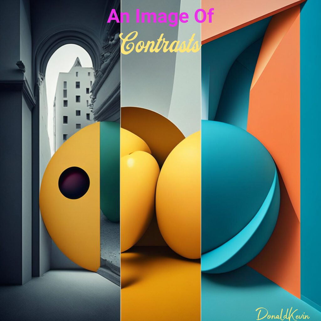
 In conclusion, composition and layout in graphic design are vital fundamentals that can make or break the success of your visual communication. By understanding and implementing the principles of alignment, repetition, and contrast, you can take your designs to new heights, captivating your audience and leaving a lasting impression.
 If you have any questions or need further guidance on composition and layout in graphic design, please feel free to contact me. I would love to hear from you and am here to support and assist you on your design journey.
  One of the most important aspects of composition and layout is balance. Balance refers to the distribution of visual weight within a design. A well-balanced design will feel stable, harmonious, and comfortable to the eye. There are two types of balance: symmetrical and asymmetrical. Symmetrical balance occurs when the visual elements of the design are evenly spaced and mirrored on both sides of an imaginary central axis.
  White space, also known as negative space, is the area between design elements. It is just as important as the elements themselves as it helps to create visual breathing room and balance. White space can be used to direct the viewer’s attention and create a sense of hierarchy. It can also be used to create a sense of elegance and sophistication in a design. It is also important in a design to use repetition to add visual interest as well.
  Using white space effectively can make a design look more sophisticated and elegant because it gives the eye a place to rest and creates a sense of balance and harmony. Without white space, a design can look cluttered and overwhelming, making it less effective and less appealing to the viewer. I have no idea how this print of my bedroom got in here!
 It allowed for the mass production of books, newspapers, and other printed materials, making information more accessible to the general public. The printing press also led to the development of typography, which allowed for the creation of more elaborate and decorative typefaces. Today, typography is still an essential part of graphic design and plays a crucial role in communicating ideas and messages to the audience.
 Choosing the right typeface can make or break a design. One of the best ways to achieve a visually striking design is to use contrasting typeface. This approach involves using two different typefaces, each with a distinct style and character. When used effectively, contrasting typeface can help to create a strong visual hierarchy, add emphasis, and provide a unique personality to your design.