Browsed by
Category: Uncategorized

Breaking the Rules: Pushing Boundaries in Graphic Design to Create Iconic Designs!

Breaking the Rules: Pushing Boundaries in Graphic Design to Create Iconic Designs!

Hey there and welcome to DonaldKevin.com as we take a look at Breaking The Rules: Pushing Boundaries In Graphic Design To Create Iconic Designs! I don’t know about you but I like to break the rules from time to time and in the world of graphic design, creativity knows no bounds. Graphic designers have the power to captivate their audience and leave a lasting impression through their artwork. However, to truly make an impact, one must be willing to break the rules and push the boundaries of traditional graphic design. In this article, we will explore the importance of breaking graphic design rules and how it leads to the creation of iconic designs.

Embracing The Chaos In Graphic Design:

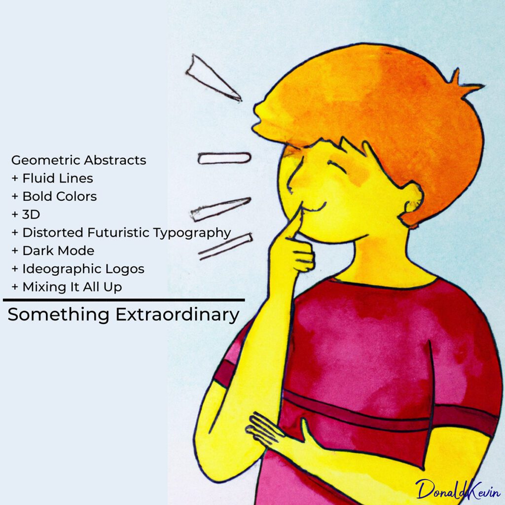
While it is essential to have a basic understanding of design principles, it is equally necessary to know when and how to break them. In graphic design, rules are meant to be challenged, allowing designers to explore new territories and create visually stunning pieces. By embracing chaos and incorporating unconventional elements, designers can create designs that stand out from the crowd.

Striking A Balance In Graphic Design:

While breaking the rules in graphic design can lead to innovative and memorable creations, it is important to strike a balance. It is crucial to understand the fundamental principles of design before intentionally breaking them. This knowledge enables designers to make informed decisions and ensures that their work remains visually appealing and effective. By consciously bending the rules rather than completely disregarding them, designers can create designs that captivate the audience while still conveying the desired message.

Typography Techniques In Graphic Design:

Typography plays a vital role in the world of graphic design, and pushing its boundaries can yield stunning results. By experimenting with various fonts, sizes, and styles, designers can create typographic designs that are truly unique and eye-catching. From bold and playful to minimal and sophisticated, typography techniques can be used to evoke different emotions and enhance the overall design. Breaking traditional typographic rules can help designers create visually dynamic compositions that leave a lasting impression on the viewer.

Color Outside The Lines:

Color is a powerful tool in graphic design, and pushing its boundaries can lead to striking and memorable designs. Breaking the rules of color theory allows designers to create unexpected combinations and challenge traditional notions of harmony. By embracing unconventional color schemes, designers can evoke specific moods and emotions, making their designs stand out in a sea of conformity. Pushing the boundaries of color also opens up opportunities for unique branding and visual identities, helping businesses establish a distinctive and recognizable presence.

Breaking The Graphic Design Grid:

The grid is a fundamental principle of graphic design, providing structure and organization. However, pushing its boundaries can result in groundbreaking designs that capture attention. By breaking free from the confines of a strict grid, designers can create compositions that are visually dynamic and unexpected. This approach allows for greater creativity and experimentation, leading to designs that break the mold and become iconic. Embracing asymmetry, overlapping elements, and unconventional layouts can help designers push the boundaries of the grid and create designs that are truly remarkable.

Negative Or White Space In Graphic Design:

Negative space, often overlooked, is an excellent opportunity for breaking graphic design rules. By intentionally allowing blank spaces in a design, designers can create a sense of balance, simplicity, and elegance. Negative space highlights the main elements of a design and guides the viewer’s attention, resulting in visually striking and iconic designs.

Utilizing Mixed Media:

Incorporating different mediums and techniques in graphic design can transcend traditional boundaries and open new doors for creativity. By merging digital and analog artwork, designers can create unique textures, gradients, and effects. The combination of various mediums adds depth and complexity to the designs, making them stand out in a crowded marketplace.

To Sum It All Up:

Breaking the rules in graphic design is a powerful way to create iconic designs that leave a lasting impression. By pushing the boundaries of traditional design principles, designers can explore new territories, experiment with unconventional elements, and captivate their audience with visually stunning artwork. Through typography techniques, daring color choices, strategic use of negative space, and incorporating mixed media, designers can create designs that defy expectations and make a significant impact. So, go ahead, break the graphic design rules, and unleash your creativity to create iconic designs that stand the test of time. Thank you so much for taking the time to stop by today. Stay Groovy and CREATE!

Stay groovy and create text set against a red circular background.
UNLEASHING CREATIVITY: GRAPHIC DESIGN TRENDS FALL 2023 PART 2

UNLEASHING CREATIVITY: GRAPHIC DESIGN TRENDS FALL 2023 PART 2

Hey there! Donald Kevin here, thank you for visiting, and welcome to “Unleashing Creativity: Graphic Design Trends Fall 2023 Part 2.” Are you ready to step into the future? Well, buckle up because in this week’s blog post, we are diving deep into the exciting world of graphic design trends for Fall 2023! Last time, we explored the vibrant world of bold colors and geometric shapes in design. But this week, get ready to push the boundaries even further as we unleash our creativity with futuristic and distorted typefaces, embrace the mesmerizing dark mode, delve into the world of ideographic logos, and discover the art of mixing elements in ways you’ve never seen before. Join us on this wild ride as we explore the untamed jungle of design possibilities. Put on your seatbelt and prepare to be amazed!

Distorted And Futuristic Typography In Graphic Design:

As we dive deeper into uncovering the top graphic design trends for Fall 2023, one particular trend that has caught our attention is the use of distorted and futuristic typography. This bold and daring approach to typography not only brings excitement and energy to designs but also pushes the boundaries of creativity.

Typography, often considered an art form in itself, has evolved over the years, constantly embracing new techniques and styles. In Fall 2023, designers are taking typography to a whole new level by distorting letters, warping them, and giving them a futuristic touch. This trend is perfect for those looking to make a statement or capture attention in a visually saturated world.

By manipulating the shapes and forms of letters, designers can create a sense of movement and dynamism in their designs. The distorted typography adds an avant-garde feel, transporting viewers into a futuristic realm. This trend is all about breaking the traditional rules of typography and embracing a more experimental and unconventional approach.

Moreover, the use of distorted typography gives designers the freedom to play with legibility and hierarchy. By intentionally distorting certain parts of the letters while keeping the main structure intact, designers can guide the viewer’s eye and emphasize certain words or phrases. This technique adds an extra layer of depth and complexity to the design, making it more engaging and visually captivating.

Dark Mode in Graphic Design:

When it comes to dark mode, the possibilities are endless. Designers can explore the depths of their creativity by embracing the mysterious allure of dark backgrounds. This trend allows for a bold and visually striking aesthetic that captivates the audience from the moment they set their eyes on it.

The key to successfully implementing dark mode in graphic design is to strike the perfect balance between light and dark elements. Contrasting vibrant pops of color against the dark backdrop can elevate the overall visual appeal and create a sense of depth. This technique adds an element of surprise and intrigue that keeps the viewers engaged and wanting to explore more.

One of the most exciting aspects of dark mode is its ability to create a dramatic impact. Dark backgrounds provide a perfect canvas for showcasing typography, illustrations, and even animations. By making use of vibrant colors and intricate detailing, designers can make their creations truly come alive and mesmerize the audience. This trend amplifies the impact of any design, allowing for a truly immersive experience that leaves a lasting impression.

Adopting dark mode in graphic design also offers practical benefits. With the increasing popularity of mobile and tablet devices, dark mode optimizes readability and visibility for users. It reduces eye strain and enhances readability, making it an excellent choice for websites, apps, and other digital platforms. The sleek and modern aesthetic that dark mode brings also adds sophistication to any design

Ideographic Logos In Graphic Design:

Ideographic logos, also known as pictorial or symbol logos, are once again capturing the imagination of graphic designers. These unique and visually striking logos replace traditional typographic elements with powerful and imaginative symbols that convey a brand’s essence in an artful way. By harnessing the power of symbols and icons, designers are able to distill complex concepts into a single image, making it easier for brands to leave a lasting impression on their audience.

What makes ideographic logos particularly exciting is their versatility. Their simplicity and ability to transcend language barriers make them a powerful tool for global brands. One iconic example is the Apple logo—an elegantly bitten apple that encapsulates the brand’s core values of innovation and simplicity. With Fall 2023’s renewed focus on ideographic logos, we can expect to witness a surge of creative and captivating symbols that will revolutionize brand identities.

As we move further in to Fall 2023, designers are experimenting with unconventional color schemes to breathe new life into their ideographic logos. Blending contrasting colors in unexpected ways adds a touch of excitement and intrigue to these symbols. From bold and vibrant gradients to sophisticated monochromatic combinations, designers have the freedom to push the boundaries and create unforgettable brand visuals. The fusion of unexpected colors will undoubtedly captivate consumers and solidify brand impressions.

Mixing Elements In Graphic Design

As art imitates life (or is it the other way around? I’m never quite sure), It’s no surprise to this writer that a diverse blend of elements is becoming the norm in graphic design. Designers are no longer limited to using a single style or inspiration. Instead, they are encouraged to mix and match different elements, such as textures, colors, and typography, to create unique and visually stunning designs. This trend allows for endless possibilities and opens up a world of creativity.

Mixing elements in graphic design enables designers to break free from traditional design rules and conventions. It allows them to explore new ways of combining contrasting elements to create a captivating visual experience. By combining unexpected elements, such as vintage and futuristic styles or hand-drawn illustrations with digital elements, designers can spark curiosity and surprise their audience.

This trend embraces the idea that opposites attract. By juxtaposing elements that are seemingly contradictory, designers can create a visually striking composition that demands attention. Mixing different textures, for example, can add depth and dimension to a design, making it more engaging and memorable. This approach encourages designers to think outside the box and challenge the norms of traditional graphic design.

To Sum It all Up:

In this two-part series, we looked at fall 2023 trends. While not exhaustive, it should give you a good foundation on which to build. So go ahead, be bold, get creative, and go forward in confidence in your approach to graphic design. Use vibrant and bold colors, experiment with geometric lines, and add some fluidity of movement for diversity’s sake. Embrace the drama that dark mode creates and distort your text, even if only a little. Have fun! Thank you for visiting DonaldKevin.com. Stay groovy and CREATE!

Stay groovy and create text set against a red circular background.
Unleash Your Creative Potential with ‘How To Graphic Design: The Course of Fundamentals’ – A Game-Changer from 4 The Creatives!

Unleash Your Creative Potential with ‘How To Graphic Design: The Course of Fundamentals’ – A Game-Changer from 4 The Creatives!

Hey there and welcome to DonaldKevin.com as we look into how to Unleash Your Creative Potential with ‘How To Graphic Design: The Course of Fundamentals’ – A Game-Changer from 4 The Creatives! I know we had a look at Fall Trends Part 1 last week and this week is supposed to be Part 2. But sometimes life happens. I hope you get value from today’s post.   

If you’ve ever felt the magnetic pull of the design world, then prepare to be blown away by the transformative powers of ‘How To Graphic Design: The Course of Fundamentals’. As an enthusiast with an insatiable appetite for all things design, this comprehensive digital product has taken my graphic design skills to new heights, leaving me buzzing with excitement for an opportunity to grow in this dynamic field.

One of the true gems of this course is the mastermind behind it all – the talented and award-winning designer, Lauren Gonzalez. With her unrivaled expertise and industry insights, I knew I was in the best hands possible. Lauren’s teaching style is a breath of fresh air, simplifying complex concepts and infusing each lesson with her contagious passion for design. You can’t help but be inspired!

From mastering Adobe Photoshop to conquering Adobe InDesign, every aspect of the graphic design process is dissected into bite-sized, easy-to-digest modules. Thanks to the step-by-step videos, even a beginner like me never felt overwhelmed. With a total of 67 videos packed with invaluable knowledge, this course becomes your trusted companion, always there to guide you on your creative journey.

But it doesn’t stop there! ‘How To Graphic Design’ goes above and beyond by integrating practical exercises throughout the course. These hands-on projects allow you to apply your newfound skills to real-world scenarios, boosting your confidence and solidifying your understanding of design principles. Trust me, the practical experience gained is worth its weight in gold.

What truly sets this course apart is the vibrant Facebook community group it offers. This is not just another platform – it’s a thriving hub of aspiring designers and seasoned professionals. Here, you’ll find a supportive network that eagerly shares ideas, provides feedback, and even opens doors for networking opportunities. The collaborative and motivating environment will ignite your creativity like never before.

Let’s not forget the exceptional support provided by the course creator. Whenever I stumbled upon a challenge or had a burning question, the prompt and friendly responses from the support team were a game-changer. With their unwavering assistance, my learning journey remained seamless, allowing me to focus on honing my skills and unleashing my full creative potential.

And the cherry on top? Upon completion of the course, you’ll be rewarded with a well-deserved certificate of achievement. This recognition not only boosts your confidence but also becomes a valuable asset in your professional portfolio, showcasing your dedication and expertise in the world of graphic design.

In a nutshell, ‘How To Graphic Design: The Course of Fundamentals’ is a groundbreaking digital product that surpasses all expectations. With its comprehensive curriculum, expert guidance, hands-on exercises, supportive community group, and top-notch support, this course lays the rock-solid foundation you need to thrive in the design industry.

Don’t hold back on your creative dreams any longer – invest in this transformative course today! Click the link below and unlock your true potential with ‘How To Graphic Design: The Course of Fundamentals’.”

Stay groovy and create text set against a red circular background.
Unleashing Creativity: Graphic Design Trends Fall 2023 Part 1

Unleashing Creativity: Graphic Design Trends Fall 2023 Part 1

Hey there and welcome to DonaldKevin.Com and Unleashing Creativity: Graphic Design Trends Fall 2023 Part 1. Since today is the first day of fall what better topic than this to discuss eh? Graphic design trends are constantly evolving, and it’s essential for designers to stay ahead of the curve. Fall 2023 brings with it a fresh crop of game-changing graphic design trends that are sure to unleash your creativity and elevate your designs to new heights. In this article, we will explore the top graphic design trends for Fall 2023, giving you the insights and inspiration you need to create stunning and impactful designs. So, without further ado, let’s dive into the world of graphic design trends Fall 2023!

Bold and Vibrant Colors In Graphic Design:

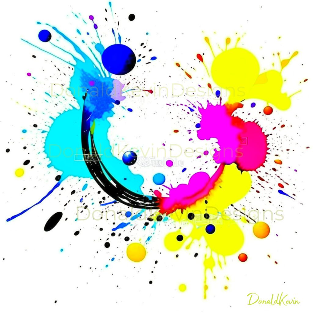
Get ready to step outside the traditional color palette! Fall 2023 is all about embracing bold and vibrant colors that instantly catch the eye and make a powerful statement. Think electric blues, neon greens, and fiery oranges that add an unexpected pop to your designs. These eye-catching shades inject a dose of energy and life into your compositions, leaving a lasting impression on your audience. Buckle up and get ready to unleash your creativity with this exciting trend!

Graphic Designs That Make A Statement: Be Bold, Be Heard!

If you want your designs to make an impact, it’s time to go big! Fall 2023 is all about graphic designs that make a statement, leaving no room for subtlety. Amplify your messages by incorporating bold typography, striking visuals, and unconventional layouts. Be fearless in expressing your ideas and beliefs through your designs, as this is the year to stand out from the crowd. Design is a powerful tool, and with the right bold choices, you can create a visual that resonates deep within your audience.

Abstract and Geometric Shapes In Graphic Design:

One of the most exciting trends dominating the design scene is the use of abstract and geometric shapes. These shapes can add depth, intrigue, and a modern edge to your designs. By incorporating overlapping shapes, intersecting lines, and irregular patterns, you can truly unleash your creativity and captivate your audience.

Abstract and geometric shapes are not only visually striking but also incredibly versatile. Whether you’re designing a poster, a logo, or a website, incorporating these shapes can give your work a fresh and innovative look. The beauty of abstract shapes lies in their ability to evoke emotion and create a sense of movement. Bold colors and unique combinations add to the overall impact of the design, making it visually stunning and unforgettable.

The use of overlapping shapes can provide a sense of depth and dimension to your designs. By layering different shapes on top of each other, you can create a visually complex and visually compelling composition. This technique allows for endless possibilities and can be combined with other design elements such as typography and color to create a cohesive and captivating design.

Intersecting lines offer a dynamic and energetic feel to your designs. They can be used to guide the viewer’s eye and draw attention to specific elements within your composition. Whether it’s vertical, horizontal, or diagonal lines, their intersection creates a visually striking effect that demands attention. Play around with different line weights and styles to create a unique and impactful design.

Irregular patterns add an element of surprise and unpredictability to your designs. They break away from traditional design structures and bring a sense of excitement and movement. The use of irregular patterns can add rhythm and interest to your compositions.    

3D And Abstract Illustrations In Graphic Design:

One captivating trend that is set to take the graphic design world by storm is the incorporation of 3D and abstract illustrations. Designers are pushing the boundaries of creativity, bringing visually stunning and mind-bending artworks to light. With advancements in technology, these illustrations are now more realistic and dynamic than ever before. Imagine stepping into a world where visuals come to life, where you can almost reach out and touch the design. Get ready for a visually exhilarating experience!

The use of 3D and abstract illustrations in graphic design offers endless possibilities for creating eye-catching and immersive visuals. As graphic designers we have the ability to experiment with unique perspectives, textures, and dimensions, that can result in striking compositions that captivate the viewer’s attention. Think of a surreal landscape popping out of your screen or a product showcasing its intricate details, almost as if you can see it from all angles. These illustrations bring depth and a sense of realism to the otherwise ordinary, and designers are embracing this exciting medium with open arms.

One of the most exciting aspects of the fall design trend of 3D and abstract illustrations is the ability to convey complex ideas and emotions through visual storytelling. Designers can create intricate narratives and abstract concepts, allowing viewers to interpret and engage with the artwork in their own personal way. From mesmerizing geometric patterns to dreamlike compositions, these illustrations evoke a sense of wonder and curiosity. The use of vibrant colors and imaginative shapes further enhances the overall impact, leaving the audience intrigued and craving for more.

In Conclusion:

In conclusion, the Fall trends of 2023 have truly blown us away! From vibrant colors to mesmerizing abstract and geometric shapes, this season is all about pushing the boundaries of creativity in graphic design. And we’re only scratching the surface! Join us next week for Part 2 where we dive into the world of typography and unveil more innovative trends that will leave you inspired and eager to unleash your artistic prowess. Get ready to take your designs to a whole new level! Stay tuned and let the excitement continue to fuel your passion for graphic design. Thank you again for visiting DonaldKevin.com. Stay Groovy And Create! Happy creating!

Stay groovy and create text set against a red circular background.
GRAPHIC DESIGN TIPS: HOW TO CREATE EYE-CATCHING SOCIAL MEDIA POSTS PART 4

GRAPHIC DESIGN TIPS: HOW TO CREATE EYE-CATCHING SOCIAL MEDIA POSTS PART 4

Hey there and thank you for visiting DonaldKevin.com. Are you ready for the grand finale? We’ve reached the end of our four-part series Graphic Design Tips: How To Create Eye-Catching Social Media Posts through graphic design! In the first three parts, we covered everything from the importance of graphic design in social media to the nitty-gritty design tips for creating captivating visuals. We even dived into the art of posting images on Instagram, Facebook, Twitter, and Pinterest. But hold on tight because Part 4 is here to wrap up this exhilarating journey with a bang! Get ready to unlock the secrets of simplicity, consistency, testing, and staying updated to ensure your social media game stays on top. Trust me, this final part is going to be fun and informative! So, let’s dive into this last chapter and take your graphic design skills to new heights. It’s time to conquer the world of social media like never before!

Keeping Graphic Designs Simple, Clean and Uncluttered: Allowing the Key Message to Shine Through!

Simplicity is the ultimate sophistication, as the great Leonardo da Vinci once said. When it comes to graphic design for social media, simplicity is the key to capturing attention in a world full of distractions. By keeping your designs simple, you allow your key message to take center stage and hold the viewer’s attention. Remember, less can be more! Some people say is, I say can be.

A clean design ensures that your social media posts remain visually appealing and easy to consume. With the ever-increasing amount of content bombarding users’ feeds, it is crucial to make your design stand out by being clutter-free. Choose a minimalistic approach by using ample white space, clear fonts, and a limited color palette. Your audience will appreciate the ease with which they can grasp your message amidst the noise of the social media world. 

Uncluttered designs not only make your message more prominent but also enhance the overall user experience. Avoid overcrowding your posts with excessive text or graphics. Instead, focus on creating a design that guides the viewers’ eyes effortlessly towards your intended message. A clutter-free post allows the audience to quickly grasp the information you’re sharing, making it more likely to be remembered or shared. Let your content breathe and make an impact!

Consistency In Social Media Posts:

Consistency is another key aspect to creating eye-catching social media posts. By maintaining a consistent style, color palette, and overall aesthetic, you can help build brand awareness and recognition among your audience. When followers see a post from your brand on their feed, they should be able to immediately recognize it as yours simply by the look and feel. This consistency not only creates a cohesive visual identity for your brand but also helps to establish trust and credibility.

One way to ensure consistency is by using templates or design presets. By creating a standard template for your social media posts, you can easily plug in new content while maintaining a consistent design. Templates can include things like a specific font, logo placement, and color scheme. This way, every time you create a new post, it will have a similar feel to your previous ones. Consistency like this will ensure that your brand is easily recognizable and helps to reinforce your overall brand message.

In addition to design consistency, it’s also important to maintain a consistent tone of voice across your social media posts. This refers to the way you communicate with your audience and the language you use. Whether you want to be playful and lighthearted or professional and informative, it’s essential to choose a tone that aligns with your brand’s overall personality. Using consistent language and tone helps to establish a sense of familiarity and builds a stronger connection with your audience.

Another way to create eye-catching social media posts is by incorporating interactive elements. Social media platforms offer a variety of interactive features such as polls, quizzes, and question stickers. By using these features, you can engage your audience and make them active participants in your content. Interactive elements not only increase engagement but also make your posts more memorable and shareable. They spice up your content and make it stand out in a sea of regular posts.      

Design Trends And Best Practices In Social Media:

Keeping up with the latest design trends and best practices is crucial to creating eye-catching social media posts. In this fast-paced digital world, staying updated is the key to staying ahead of the competition. So, grab your creative tools and get ready to explore the exciting ways to enhance your social media graphics!

Incorporate Trendy Color Palettes: Colors have the power to evoke emotions and influence the way people perceive your brand. By staying updated with the latest color trends, you can make your social media posts visually striking. Experiment with trendy color palettes that align with your brand’s personality and style. Whether it’s the vibrant and energetic neon colors or the soft and calming pastel shades, choose colors that reflect the mood you want to convey. Just remember to maintain consistency in your color choices to create a cohesive and visually appealing feed.

Experiment with Bold Typography: Typography plays a significant role in grabbing the attention of your audience. Stay excited about mixing and matching different font styles to create visually stunning social media posts. Be bold and experiment with oversized headlines, artistic scripts, or even some playful handwritten fonts. The key is to make sure your typography is readable and complements the overall design. Combined with creative layouts and eye-catching graphics, bold typography can make your social media posts stand out from the crowd.

Focus on Engagement: To create truly eye-catching social media posts, it’s important to think beyond just aesthetics. Increase engagement by incorporating interactive elements into your designs. Add polls, quizzes, or question stickers to encourage your audience to participate. This not only grabs attention but also creates a sense of community around your brand. Remember, social media is all about being social, so make sure your posts invite conversations and leave room for your followers to engage with your content.

In Conclusion:

In conclusion, we have reached the end of our very cool and groovy 4-part series on graphic design tips for creating eye-catching social media posts! I hope you have enjoyed this journey as much as I have. Throughout this series, we have explored various techniques, from selecting the right color palette to utilizing fonts effectively, to help you create visually stunning posts that will captivate your audience. By applying these tips and tricks, you will surely elevate your social media game to new heights! So what are you waiting for? Get out there and start designing! Exciting times lay ahead as you conquer the social media world with your eye-catching posts. Don’t forget to share your success stories with me. Stay tuned for more exciting content and happy designing! Stay groovy and thanks again for visiting DonaldKevin.com

Stay groovy and create text set against a red circular background.
GRAPHIC DESIGN TIPS: HOW TO CREATE EYE-CATCHING SOCIAL MEDIA POSTS PART 3

GRAPHIC DESIGN TIPS: HOW TO CREATE EYE-CATCHING SOCIAL MEDIA POSTS PART 3

Hey there and thank you for visiting DonaldKevin.com. Today we are going to continue with our journey on Graphic Design Tips: How To Create Eye-Catching Social Media Posts Part 3. So then…are you ready to take your social media game to the next level? Look no further! In this third installment of our graphic design tips series, we’ll be diving into the “big 5” social media platforms: Instagram, Facebook, Twitter, LinkedIn, and Pinterest. Get ready to create eye-catching social media posts that will make your followers stop scrolling and start engaging. Whether you’re a seasoned graphic designer or just getting started, these tips are sure to inspire and ignite your creativity. So, grab your design tools and let’s embark on this exciting journey together!

Graphic Design For Instagram: Creating Stunning Visuals For The Grid And Stories

Instagram is the perfect platform to showcase your brand’s personality and aesthetics. With millions of users scrolling through their feeds every day, it’s crucial to create visuals that stand out and leave a lasting impression. But how can you achieve this? Let’s dive in!

When designing for the Instagram grid, consistency is key. Your grid is like a visual portfolio that represents your brand, so make sure to maintain a cohesive look and feel. Stick to a color palette that aligns with your brand identity and choose fonts that complement your style. Whether you prefer a clean and minimalist approach or a more vibrant and eclectic vibe, make sure your visuals reflect your brand’s personality.

In addition to a consistent aesthetic, don’t forget to pay attention to the composition of your grid. The grid layout is a great opportunity to tell a story or create a visual narrative. Experiment with different arrangements and consider using a mix of images, quotes, and graphics to keep your audience engaged. Remember, the goal is to create a visually pleasing and cohesive grid that encourages users to hit that follow button!

Now, let’s talk about creating stunning visuals for Instagram stories. With stories being one of the most popular features on the platform, it’s essential to make them eye-catching and engaging. Take advantage of the various features offered by Instagram, such as polls, stickers, and GIFs, and short videos to add interactivity to your stories. This not only grabs attention but also encourages your audience to interact with your content.

When it comes to design elements, think outside the box. Use bold colors, unique fonts, and captivating images to make your stories stand out from the crowd.

Graphic Design For Facebook: Optimizing Images For Maximum Engagement

Facebook, the giant of social media, is a platform that cannot be ignored when it comes to creating eye-catching social media posts. With billions of active users, the potential reach for your content is enormous. So, how can you optimize your images to ensure maximum engagement on this platform? Let’s dive right in!

>>> Understand the Facebook image dimensions: Facebook has specific dimensions for images, and it’s crucial to adhere to them for your posts to look visually appealing. The ideal dimensions for a Facebook post image are As follows…Profile photo: 170 x 170 pixels, Cover photo: 851 x 315 pixels, Landscape: 1200 x 630 pixels, Portrait: 630 x 1200 pixels and Square: 1200 x 1200 pixels. By using these dimensions, your image will be displayed perfectly on both desktop and mobile devices, ensuring that your audience gets the best viewing experience.

>>> Use vibrant colors and high-quality images: Facebook is a platform that thrives on visually appealing content. To catch the attention of your audience, use vibrant colors that stand out from the crowd. Experiment with different color combinations that complement your brand’s identity. Additionally, ensure that the images you use are of high quality. Blurry or pixelated images can give a negative impression and deter users from engaging with your posts


Text Overlay Is Lyrics to Jethro Tull’s “Heavy Horses”

>>> Incorporate text overlays strategically: While images are crucial for engagement, adding text overlays can further enhance the impact of your posts. Facebook allows you to add text to your images, so why not use this feature to your advantage? However, it’s important to be mindful of the amount of text you include. Facebook’s guidelines recommend keeping text in images to a minimum as excessive text can lead to decreased reach. So, choose your words wisely and ensure they complement the visual element of your post.

>>> Optimize your images for mobile: With the majority of Facebook users accessing the platform through their mobile devices, it’s essential to optimize your images accordingly. Make sure your images are mobile-friendly by using a design that adapts well to smaller screens. Avoid using small text or intricate details that may be difficult to read or follow.

Graphic Design For Twitter: Using Infographics and Memes to Capture Attention

Twitter is a fast-paced platform where brevity is key. With a limited character count, it can be challenging to convey your message effectively. This is where infographics come to the rescue! Infographics are visually appealing representations of information that are easy to digest and share. By using eye-catching colors, engaging icons, and concise text, you can quickly convey complex ideas in a visually appealing way. Infographics are perfect for Twitter as they are easily shareable, allowing your content to reach a wider audience.

Another way to grab attention on Twitter is by incorporating memes into your posts. Memes are humorous images or videos that are widely shared across the internet. By leveraging popular memes that resonate with your target audience, you can inject some humor into your tweets and stand out from the crowd. Memes are a great way to connect with your audience on a personal level and make your brand more relatable. However, it’s essential to ensure that the meme aligns with your brand’s values and tone of voice to maintain consistency.

When creating infographics and memes for Twitter, it’s crucial to optimize them for the platform. Twitter has specific image dimensions that you should adhere to for the best display. By resizing your graphics to fit within the recommended dimensions, you can ensure that your posts look polished and professional. Additionally, consider incorporating your brand colors and logo into the design to maintain brand consistency across all your social media channels.

To make your Twitter posts even more eye-catching, experiment with different font styles and sizes. Play around with bold and italicized text to emphasize key points or call-to-action phrases. Avoid using too many fonts in a single graphic as it can look confusing and visually unappealing.

Graphic Designing For LinkedIn: Designing Professional And Informative Graphics

LinkedIn is not just a platform for job hunting and professional networking; it has also become a powerful tool for branding and marketing. With its ever-increasing user base, it is essential to create eye-catching social media posts that stand out amongst the competition. In this blog post, we will focus on designing professional and informative graphics specifically for LinkedIn.

When it comes to LinkedIn, professionalism is key. Your graphics should reflect the tone and style of the platform, maintaining a clean and polished look. Start by choosing a color scheme that aligns with your brand and industry. Stick to neutral and professional colors like blues, grays, and whites. These colors convey trustworthiness and reliability. Avoid using loud and vibrant colors that may distract or deter your audience.

In terms of typography, opt for clean and easily readable fonts. Sans-serif fonts like Arial or Helvetica are often the preferred choice for LinkedIn graphics. They are simple, modern, and easy to read even in smaller sizes. Make sure to maintain consistency in your font choices throughout your graphics to establish a cohesive and professional appearance.

When it comes to the content of your LinkedIn graphics, focus on providing valuable and informative content to your audience. LinkedIn is a platform where professionals seek knowledge and insights. Create graphics that offer tips, industry trends, or thought-provoking questions. Infographics and data visualizations are particularly effective in conveying complex information in a visually appealing manner.

In terms of design elements, simplicity is key on LinkedIn. Keep your graphics clean and clutter-free. Use ample white space to create a sense of balance and highlight the most important information. Incorporate your brand’s logo and visual elements subtly, ensuring they do not overpower the overall design.

Lastly, don’t forget to optimize your graphics for LinkedIn’s platform. Ensure that your images are of the recommended dimensions for optimal display. LinkedIn’s recommended image size for a shared image post is 1200 x 627 pixels.

Graphic Designs For Pinterest: Utilizing Vertical Graphics for Enhanced Visibility

The key to success on Pinterest lies in creating eye-catching vertical graphics. Pinterest is all about visuals, and vertical graphics have proven to be the most effective format for capturing users’ attention. So, let’s get creative and start designing those stunning vertical graphics that will make your Pinterest account stand out from the crowd.

When it comes to designing vertical graphics for Pinterest, size matters. The optimal size for a Pinterest graphic is 600 pixels wide by 900 pixels tall. This size ensures that your graphic takes up enough real estate on the Pinterest feed to catch the eye of users scrolling through. So, make sure to adjust your design canvas accordingly to create the perfect vertical graphic.

Another important aspect to consider when designing for Pinterest is the use of bright and bold colors. Pinterest is a platform filled with vibrant and visually appealing content, so you need to make sure your graphics can compete. Don’t be afraid to use bold color combinations and experiment with different shades. Remember, the goal is to create eye-catching visuals that make users stop scrolling and click on your pins.

In addition to captivating colors, incorporating compelling typography into your vertical graphics can also make a huge difference. Choose fonts that are easy to read but still add a touch of personality to your designs. Experiment with different font sizes, styles, and placements to create a visually appealing composition. By combining beautiful typography with captivating visuals, you’ll have a winning combination that will make your Pinterest posts irresistible.

Don’t forget to optimize your vertical graphics for mobile users. Pinterest is primarily accessed through mobile devices, so it’s crucial that your designs are mobile-friendly. Ensure that your graphics are easily viewable and legible.

In Conclusion:

In conclusion, mastering the art of creating eye-catching social media posts on the “big 5” platforms – Instagram, Facebook, Twitter, Linkedin, and Pinterest – is a game-changer for any business or individual looking to make their mark in the digital world. We’ve covered some amazing tips and tricks throughout this series so far, and the possibilities are truly endless. So, get ready to unleash your creativity and watch your social media presence skyrocket!

Remember, these platforms are constantly evolving, so stay updated and adapt your strategies accordingly. Embrace the excitement of connecting with your audience in ways you never thought possible and let your imagination run wild. The world is your canvas, so go ahead and create those eye-catching social media posts that will leave everyone wanting more.

And again, thank you for visiting DonaldKevin.com. Happy designing! Stay groovy and create!

Stay groovy and create text set against a red circular background.
GRAPHIC DESIGN TIPS: HOW TO CREATE EYE-CATCHING SOCIAL MEDIA POSTS PART 2

GRAPHIC DESIGN TIPS: HOW TO CREATE EYE-CATCHING SOCIAL MEDIA POSTS PART 2

Hey there and welcome to DonaldKevin.com. Let’s continue with part two of Graphic Design Tips: How To Create Eye-Catching Social Media Posts. Are you ready to take your social media game to the next level? In today’s blog post, we are diving deeper into the world of graphic design to bring you even more tips and tricks on how to create eye-catching social media posts. Whether you’re a business owner looking to boost your online presence or a creative individual wanting to enhance your personal brand, this is the ultimate guide you’ve been waiting for! So buckle up, because we’re about to unleash the secrets behind captivating visuals that will make your social media feed truly stand out from the crowd. Get ready, because your followers won’t be able to scroll past your posts without hitting that like button! Very cool and groovy!

Color Psychology In Graphic Design.

When it comes to graphic design, understanding the psychology of color is paramount. Color has the ability to evoke emotions and influence our perceptions, making it a powerful tool in creating eye-catching social media posts. By utilizing color psychology in graphic design, you can effectively capture the attention of your audience and convey your message in a visually engaging way. For example, using warm and vibrant colors like red and yellow can create a sense of excitement and energy, perfect for grabbing attention in a crowded social media feed.

Color psychology is particularly important when it comes to social media posts. With the constant stream of content bombarding users, it’s crucial to make your posts stand out. By understanding the impact of color on social media, you can strategically select hues that align with your brand and message. For instance, blue is often associated with trust and reliability, making it a popular choice for financial institutions or healthcare providers, while green represents growth and freshness, ideal for eco-friendly brands. By tapping into the psychology of color, you can create a visual identity that resonates with your target audience.

Incorporating color psychology into your social media posts doesn’t mean you have to abandon your brand’s existing color scheme. Instead, consider using contrasting colors to make certain elements pop. By pairing complementary colors, such as blue and orange or purple and yellow, you can create a visually appealing contrast that draws the viewer’s eye. Additionally, don’t forget about the power of simplicity. Sometimes, a clean and minimalist approach can make a stronger impact than a cluttered design. By experimenting with different color combinations and layouts, you can find the perfect balance that makes your social media posts both eye-catching and effective. Read more about color here >>> The Fundamentals Of Color In Graphic Design Part 2 <<<

Typography In Graphic Design Social Media Posts

Typography plays a crucial role in graphic design, especially when it comes to social media posts. It involves the art of arranging and designing type to make written language legible, readable, and visually appealing. The importance of typography in graphic design cannot be overstated as it helps to convey the intended message effectively. Choosing the right typeface, font, size, and style can greatly enhance the overall look and feel of a social media post, making it more engaging and attracting the attention of the target audience.

When it comes to typography in graphic design for social media posts, it is important to understand that different fonts evoke different emotions and convey different messages. For instance, a bold and stylish typeface font may be suitable for announcing a sale or promotion, while a more elegant and sophisticated font may be better suited for branding purposes. The choice of typography should align with the overall theme and purpose of the post, ensuring consistency and coherence in the design.

In addition to aesthetics, typography in graphic design also plays a crucial role in readability. The legibility of a social media post greatly depends on the font size and style chosen. It is important to select typeface fonts that are clear and easy to read, especially on mobile devices where the screen size is limited. By considering readability, designers can ensure that the text is easily comprehensible, allowing the audience to engage with the content effortlessly. You can read more here about using typography >>> Unlocking the Secrets of Typography: Using Typeface Part 2 <<<

Using Composition Techniques For Social Media Posts

When it comes to creating captivating social media posts, utilizing composition techniques in graphic design can make a huge difference. These techniques involve arranging elements such as text, images, and graphics in a visually appealing way. With the ever-increasing amount of content on social media platforms, it’s important to stand out from the crowd and catch the viewer’s attention. By employing composition techniques, you can create posts that are not only visually pleasing but also effectively convey your message.

One commonly used composition technique is the rule of thirds. This technique involves dividing an image or graphic into a grid of nine equal parts, with intersecting lines. By placing key elements of your post along these lines or at the points where they intersect, you can create a visually balanced and engaging composition. This technique draws the viewer’s attention to the most important parts of your post, making it more likely to be noticed and remembered.

Another composition technique to consider is the use of leading lines. Leading lines are lines within an image or graphic that lead the viewer’s gaze towards a specific point of interest. By incorporating leading lines into your social media posts, you can guide the viewer’s attention to your intended focal point. This technique helps create a sense of depth and adds visual interest to your posts, making them more engaging and memorable. Read more about composition and layout here >>> The Fundamentals Of Composition and Layout Part 2 – <<<

Using Contrast In Graphic Design For Social Media Posts

Contrast techniques in graphic design play a crucial role in creating eye-catching and impactful social media posts. By using contrast, designers can effectively highlight important elements and grab the viewer’s attention. One way to use contrast in graphic design is by experimenting with colors. Combining contrasting hues, such as black and white or complementary colors, can make your social media posts visually striking. Additionally, using contrasting typeface and font styles and sizes can help emphasize certain words or messages, making them more memorable for your audience.

When it comes to using contrast techniques for social media posts, it’s important to consider the overall layout and composition. For instance, placing a bold, colorful image against a plain or minimalistic background can create a powerful contrast, making the image pop. Similarly, using contrasting shapes or textures can add depth and intrigue to your posts. By carefully balancing contrasting elements, you can create visually pleasing and engaging graphics that will captivate your audience’s attention.

To effectively use contrast in graphic design for social media posts, it’s crucial to have a clear understanding of your brand’s message and target audience. Different contrast techniques can evoke different emotions and reactions, so it’s important to choose the right ones that align with your brand identity and resonate with your audience. Experimenting with various contrast techniques, such as light and dark, big and small, or rough and smooth, can help you find the perfect balance that will make your social media posts stand out from the crowd. You can read more about contrast here >>> The Fundamentals Of Composition and Layout Part 2 – <<<

Using Negative Or White Space In Graphic Design

Lastly, incorporating negative or white space in our designs can create clean and minimalistic social media posts. Negative space refers to the empty or blank areas in a design. By strategically using negative space, we can create a sense of simplicity and elegance in our posts. This can help to highlight the main elements and allow them to stand out. By embracing minimalistic designs, we can create visually appealing posts that are uncluttered and easy to navigate, ultimately enhancing the overall user experience.

In conclusion

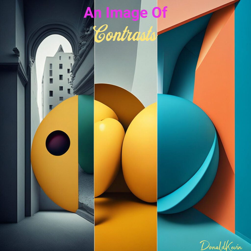
In conclusion, incorporating color psychology, typography, composition techniques, contrast, and white space into your social media posts can truly transform your online presence. By understanding the power of colors and their impact on emotions, carefully selecting typeface and fonts that reflect your brand’s personality, mastering composition techniques to guide the viewer’s eye, creating captivating contrasts, and utilizing strategic white space, you can create eye-catching social media posts that will leave a lasting impression on your audience. So, get ready to unleash your creativity and take your graphic design skills to the next level. Let your excitement shine through your captivating social media posts and watch as your online presence and engagement take off and skyrocket. Happy designing!

Thank you so much for stopping by and visiting DonaldKevin.com. Stay groovy and create!

Stay groovy and create text set against a red circular background.
Graphic Design Tips: How To Create Eye-Catching Social Media Posts Part 1

Graphic Design Tips: How To Create Eye-Catching Social Media Posts Part 1

Hey there and thank you for visiting DonaldKevin.com. I have a question for you…Do you want to create social media posts with a little more oomph? A little more pizzazz? Well, get ready to level up your game because, in this four-part series, we’ll break out the magnifying glass, search out, and discover some graphic design treasure tips that will make your social media posts pop! Whether you’re a business owner, influencer, or simply someone who wants to stand out from the crowd, you’ll be covered. In this four-part series, we’ll share some exciting tips and tricks on how to create eye-catching social media posts that will leave your followers in awe. So grab your creative hat and let’s dive into the world of graphic design!

Why Use Graphic Design In Social Media?

In today’s digital age, social media has become an essential platform for individuals and businesses to connect with their audiences. With millions of active users on various platforms such as Facebook, Instagram, and Twitter, it presents a massive opportunity for graphic designers to showcase their skills and make an impact. Social media allows designers to reach a wider audience, engage with potential clients, and build a strong online presence. It’s an exciting space where creativity knows no bounds!

Eye-catching Visuals

When it comes to social media, visuals are everything! With the average attention span decreasing, it’s vital to capture your audience’s attention within seconds. This is where graphic design hacks come into play. By creating eye-catching visuals, you can make your posts stand out from the crowd and leave a lasting impression. Experiment with bold colors, striking typography, and captivating images to create a visual feast that stops users from scrolling and makes them want to engage with your content.

Consistency is Key

Consistency plays a significant role in building a strong brand presence on social media. By maintaining a consistent visual style, you can establish brand recognition and create a cohesive look across all your social media platforms. Use the same color palette, fonts, and design elements in your posts to create a unified brand identity. This consistency will not only make your content instantly recognizable but also help establish trust and credibility with your audience.

The Power of Graphic Design in Social Media Posts

Graphic design in social media is like the secret ingredient that takes a post from ordinary to extraordinary. It allows brands and individuals to create visually appealing content that stands out in a crowded social media landscape. With well-designed graphics, posts become more memorable, shareable, and effective in conveying messages. From a beautifully designed logo to aesthetically pleasing templates, graphic design adds a professional touch to social media posts and helps establish a brand’s visual identity. It enables businesses to communicate their values, products, and services in a visually compelling manner, ultimately attracting and engaging their target audience.

In conclusion, understanding the importance of visuals in social media is crucial for anyone looking to make a mark in the digital world. Visuals have the ability to captivate users, evoke emotions, and communicate messages in a way that words alone cannot. By harnessing the power of graphic design in social media, individuals and businesses can create visually appealing content that stands out, enhances their brand presence, and increases their chances of success in the ever-evolving world of social media.

Next Week In Graphic Design.

Thank you for visiting DonaldKevin.com. It’s been my pleasure. Please come back next week for part two when we discuss:

Design Principles for Eye-Catching Social Media Posts

1️⃣ Color Psychology and Its Impact on Social Media Engagement
2️⃣ Typography: Choosing the Right Fonts for Social Media Posts
3️⃣ Composition Techniques to Create Visually Balanced Posts
4️⃣ Using Contrast to Make Your Posts Pop
5️⃣ Incorporating Negative Space for Clean and Minimalistic Designs

In the interim, stay groovy and create!

Stay groovy and create text set against a red circular background.
Visual Storytelling: How Graphic Design Breathes Life Into Ideas

Visual Storytelling: How Graphic Design Breathes Life Into Ideas

Hey there and welcome to DonaldKevin.com, fellow creative minds! Have you ever wondered how a simple image can speak volumes and convey powerful messages? Well, today as we dive into the fascinating world of graphic design, let’s take a look at where the world of art and storytelling collide. Whether you’re a seasoned designer or just starting to dip your toes into this colorful universe, this blog post is here to unravel the mysteries behind graphic design and explore how it breathes life into ideas. So, grab your favorite beverage, sit back, and let’s embark on a creative adventure together!

In today’s fast-paced world, where attention spans are shrinking and information overload is a constant challenge, visual storytelling has emerged as a powerful tool to captivate audiences and convey ideas effectively. Graphic design, with its ability to transform abstract concepts into visually appealing and engaging visuals, plays a crucial role in breathing life into ideas. This article explores the significance of graphic design in the process of brainstorming ideas and bringing them from the realm of imagination to the visible artboard.


Understanding Graphic Design:

This may be stating the obvious, but grasping and digesting this one little concept can be the defining difference between a mediocre to good design to a truly great design. Graphic design is the art of combining text, images, and colors to communicate messages visually. It encompasses various elements like typography, layout, color theory, and composition to create visually compelling designs. From print media to digital platforms, graphic design is worldwide and pervasive in our daily lives, influencing our perceptions and shaping our experiences. That is the power of graphic design.

The Power of Visuals In Graphic Design:

Humans are visual creatures, and our brains process visual information much faster than text. Visuals have the ability to evoke emotions, tell stories, and communicate complex ideas effortlessly. Graphic design harnesses this power by using a combination of visuals, colors, and typography to create a seamless narrative that resonates with the audience. This is why so many article writers, myself included, use images in their blog posts. Not only do images help the post itself to flow, but if done effectively it helps to drive home the point one is trying to make in the article or the paragraph within the article. Besides, who doesn’t like to look at pictures?

Brainstorming Ideas In Graphic Design:

Brainstorming is the initial phase of any creative process. It involves generating and exploring ideas to find creative and imaginitive solutions. Graphic design plays a crucial role in this phase by providing a visual framework to organize thoughts and stimulate creativity. By creating mind maps, mood boards, and rough sketches, designers can visually represent ideas, making them more tangible and easier to develop. When brainstorming, it is crucial to put down any idea that comes to mind, no matter how silly it may seem. Even when its not related to the subject at hand. You never know when that one little nugget will uncover a goldmine. So set some alone time and start prospecting!

From Ideas To Graphic Design Artboard:

Once the brainstorming phase is complete, it’s time to bring the ideas to life on the artboard. Graphic designers use their skills and expertise to transform abstract concepts into visually stunning designs.  Colors, typeface, fonts, and layout elements that align with the intended message and target audience are carefully selected. Through the use of various design software, designers can manipulate and refine their ideas, creating a polished final product. There are several design software that I use for that purpose and they are covered here >>>>> GRAPHIC DESIGN 101: TIPS AND TRICKS FOR BEGINNERS <<<<<

Using Graphic Design To Create A Visual Narrative:

Graphic design is like the secret sauce that brings ideas to life. It’s not just about making things look pretty; it’s about creating a visual story that captures people’s attention. With the use of consistent colors, typeface, fonts, and images, graphic designers can establish a brand’s identity and convey a specific message. So, next time you see a stunning logo or a beautifully designed website, remember that there’s a lot more to it than meets the eye.

Nowadays, it’s all about standing out from the crowd. And that’s where graphic design comes into play. By creating a cohesive visual narrative, designers can help a brand make a lasting impression on its audience. Whether it’s through a stunning social media post or an eye-catching brochure, graphic design is the key to creating a memorable experience. So, don’t underestimate the power of good design – it can truly make a world of difference.

Engaging The Audience Through Graphic Design:

In today’s fast-paced, drive-thru service, all-you-can-eat buffet, get it now before it’s gone world, where everyone is constantly bombarded with information and choices whilst going down the highway, it’s more important than ever to catch people’s attention right from the start. This is where the power of graphic design comes into play. With its ability to use captivating visuals, storytelling techniques, and strategic information placement, graphic design has the potential to create designs that truly resonate with the audience. Whether it’s an eye-catching logo, a compelling website layout, or an attention-grabbing social media post, good graphic design can both capture attention and keep viewers hooked.

In Conclusion:

When it comes to creating designs that leave a lasting impact, graphic designers are like modern-day storytellers. Through the use of visuals, graphic designers have the power to convey messages, evoke emotions, and engage the audience. From the choice of colors, typeface, and fonts to the arrangement of elements, every decision made by a graphic designer has a purpose. By carefully crafting these elements, designs can be created that not only look visually appealing but also effectively communicate the desired message.

Graphic designers have this incredible superpower to breathe life into ideas and captivate audiences through creative designs. From the perfect color palette to the carefully chosen typeface and fonts, every detail is purposefully crafted to communicate a message and evoke emotions. It’s truly amazing how a simple image or layout can tell a story and leave a lasting impact on the viewers. So next time you see a stunning design, remember that there’s an unsung hero behind it, a graphic designer who has transformed an idea into a visual masterpiece. Cheers!

Thank you for stopping by. Perhaps to read the article or perhaps only look at the pictures, thank you for visiting DonaldKevin.com. Stay groovy and Create!

Stay groovy and create text set against a red circular background.
Unlocking the Secrets of Typography: Using Typeface Part 2

Unlocking the Secrets of Typography: Using Typeface Part 2

Hey there and welcome to DonaldKevin.com. Since I posted an article last week, Graphic Design 101: Tips and Tricks For Beginners, I thought I’d continue on this path and write a little more about typography. I posted an article a few weeks back touching on the subject of using typeface in graphic design and thought I’d take it a little further this week. You can read that article here >>>> Using Typeface <<<<

Typography plays a crucial role in graphic design, yet it often goes unnoticed. It is the unsung hero that can make or break the visual appeal and effectiveness of any design. Understanding the power of typography is essential for designers who want to create stunning visuals that capture attention and convey a message effectively. In this article, we will explore the art of using typography in graphic design, delve into the difference between fonts and typefaces, uncover the secrets of finding contrasting typefaces, and discuss which typefaces work best for headings and text bodies.

The Art Of Using Typography In Graphic Design:

Typography refers to the visual arrangement of text, including the choice of fonts, sizes, spacing, and formatting. It is a powerful tool that can enhance the readability, personality, and overall impact of a design. Whether it’s a logo, website, or brochure, typography can communicate the mood, tone, and message of a brand or product.

Fonts vs. Typefaces:

Before we dive deeper into the importance of typography in graphic design, it’s crucial to understand the difference between fonts and typefaces. In simple terms, a typeface is a design concept that includes a range of fonts within it. Fonts, on the other hand, are the individual styles within a typeface, such as bold, italic, or regular. For example, Montserrat is a typeface, and Montserrat Regular and Montserrat Bold are fonts within that typeface. As a matter of fact, Montserrat is the typeface I use for the text body of my articles. I love it. It’s one of my favorites. And you thought Montserrat was just a vacation destination.

Finding Contrasting Typefaces:

One of the secrets to creating visually appealing designs is to use contrasting typefaces. Contrasting typefaces add visual interest, balance, and hierarchy to your design. When selecting contrasting typefaces, there are a few key factors to consider:

1️⃣ Contrast in style: Choose typefaces that have distinct styles to create a clear differentiation between headings, subheadings, and body text. For instance, pairing a bold and modern typeface with a more traditional and elegant one can create a visually striking contrast.

2️⃣ Contrast in weight: Varying the weight of typefaces within your design adds depth and emphasis. Using a bold typeface for headings and a lighter one for body text can create a pleasing contrast that guides the reader’s eye through the content.

3️⃣ Contrast in size: Font size plays a crucial role in visual hierarchy. Large, bold fonts for headings, moderate-sized fonts for subheadings, and smaller fonts for body text are effective in creating an easy-to-follow reading experience.

Best Typefaces For Headings:

When it comes to selecting typefaces for headings, the goal is to grab attention and make a bold statement. Here are a few typefaces that work best for headings:

1️⃣ Impact: This bold, attention-grabbing typeface is perfect for headlines that need to make an impact. Hence the name Impact.

2️⃣ Futura: With its clean and modern look, Futura is often used for headings in sleek and minimalistic designs.

3️⃣ Baskerville: If you’re aiming for a more elegant and classic look, Baskerville can lend a touch of sophistication to your headings. This is my personal favorite for headings and any time that I want to convey a sense of authority. It conveys a sense of tradition as well. To quote Angela Channing from Falcon Crest “Tradition bears weight!”

Best Typefaces For Text Bodies:

For text bodies, legibility and readability are key considerations. Here are a few typefaces that work well for longer paragraphs:

1️⃣ Garamond: This timeless typeface is known for its excellent legibility, making it ideal for body text in print materials.

2️⃣ Arial: As a widely available and versatile sans-serif font, Arial is a popular choice for web-based designs.

3️⃣ Times New Roman: Despite being considered a default choice, Times New Roman remains a reliable option for body text due to its familiarity and readability.

4️⃣ Montserrat: Using the Montserrat typeface in graphic design is a fantastic choice for creating sleek and modern designs. This versatile and elegant font adds a touch of professionalism to any project. With its clean lines and elegant curves, Montserrat typeface stands out and grabs attention.

Whether it’s for a logo, website, or print materials, incorporating Montserrat typeface instantly elevates the overall aesthetic. I love using it for designs where I want a touch of Art Deco. its lines and curves are perfect for it. And it’s my choice of typeface for this website. Baskerville headings and Montserrat body text. 


In Conclusion:

Typography is way more important than we give it credit for in graphic design. It’s like the unsung hero that quietly takes our designs to a whole new level. When we understand the art of typography and its influence on how visually appealing, readable, and organized our designs are, we can work some serious magic. From picking typefaces that contrast each other perfectly, to making sure they fit the overall vibe we want to convey, mastering the use of type is like finding the key to unlock the designer’s ultimate potential. As you can see in the before and after examples below, adding typeface takes the image to another level.

Choosing the right typeface in graphic design is like finding the perfect ingredient for a recipe. It sets the whole tone and vibe of your design. Whether you’re going for something elegant and refined or loud and edgy, the typeface you choose can make all the difference. Picture it like picking the right outfit for a specific occasion. You wouldn’t wear a suit to the beach, right? Same goes for typography. It’s all about finding the perfect match for the overall look and feel you want to achieve.

The secret of using type effectively lies in understanding the impact it has on the hierarchy and readability of your design. It’s not just about making things look pretty, it’s about guiding the viewer’s eye and making information easily digestible. Think of it as laying out a roadmap for the reader. You want to make sure that the most important information is highlighted and easily accessible, while still maintaining a pleasing visual balance. So, don’t underestimate the power of using type in graphic design, because when done right, it can elevate your designs from ordinary to extraordinary.

Again many thanks for stopping by. It’s been my pleasure to serve you. I hope I’ve served you well.

Stay groovy and create text set against a red circular background.